Scoring genre clarity...

Dollemma capsule

Dollemma

An asymmetrical multiplayer horror game with a unique appealing aesthetic. Join up to 4 friends and work together to escape the dollhouse! Or play as the Hunter and shatter the dolls before they can escape.

Free to Play5 user reviews
CasualParty Game2.5D
Dollemma TeamDec 15, 2025

Dollemma scores 80/100 — better than 89% of Casual capsules (n=10,153).

5 user reviews · Free to Play · Released Dec 15, 2025 · By Dollemma Team

Quick text summary

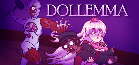
Dollemma scored 80/100 on Steam Analyzer — Good for a Casual capsule. Top priority fix: [composition] Ensure the right-edge character is moved slightly inward to guarantee safe margins and avoid Steam crop clipping across all breakpoints.

Capsule scores by dimension

  • Genre Clarity: 7/10 — Horror multiplayer identity clear. The skeletal character on the left with an axe, combined with the eerie purple color palette and unsettling doll aesthetics, successfully communicates asymmetrical multiplayer horror at full size. At TINY size, the silhouettes of multiple distinct characters remain legible and the purple-and-red color separation helps suggest danger and gameplay tension, though the specific 'multiplayer escape' mechanic is not obvious without prior knowledge.
  • Title Readability: 9/10 — Bold title stands out perfectly. The 'DOLLEMMA' title is rendered in clean, thick white sans-serif letterforms positioned in the upper-right area against a controlled purple background with no competing texture. At both SMALL and TINY sizes, the title remains fully legible and maintains strong contrast; the letter shapes do not collapse or blur into illegibility even at minimal scale.
  • Contrast & Color: 8/10 — Strong purple-red separation. The vibrant purple background (#5B2D7F approximate) creates excellent value separation from the light skin tones and white title text, while the red accents on the skeletal character and surrounding elements pop distinctly. At TINY size, the silhouette separation remains clear in grayscale; the characters read as distinct shapes against the background without muddy mid-tones or blending.
  • Uniqueness & Polish: 8/10 — Distinctive art style and appeal. The hand-drawn stylized character design with exaggerated proportions, glowing eyes, and cohesive 2D art direction creates a memorable and polished aesthetic that stands apart from typical horror game templates. The specific blend of cute dollhouse charm with unsettling horror elements is visually coherent and communicates a unique selling point beyond generic multiplayer competition.
  • Brand Consistency: 8/10 — Recognizable doll-horror identity. The consistent purple-and-red color palette, distinctive character design style, and recurring motif of stylized dolls with exaggerated features create a cohesive brand identity that would be recognizable across multiple assets. The iconic character silhouettes and color language align with a signature horror-whimsy tone that differentiates Dollemma from competing casual multiplayer titles.
  • Composition: 8/10 — Clear focal hierarchy, balanced layout. The composition features three distinct character silhouettes arranged across the frame with the skeletal axe-wielder as the primary left anchor, the pink-haired character as the secondary right focus, and the purple middle character providing layered depth. The title placement in the upper-right avoids edge clipping and maintains safe margins; at TINY size, the character arrangement still reads as balanced and the primary subject remains identifiable despite the multi-figure layout.

What works

  • Excellent title contrast and legibility. White 'DOLLEMMA' text is perfectly readable at all sizes including TINY, with clean letterforms and strategic placement on a solid background region.
  • Distinctive stylized art direction. Hand-drawn character design with exaggerated proportions and cohesive purple-red color palette creates premium, memorable aesthetic that stands apart from generic horror templates.
  • Strong silhouette separation at small sizes. Multiple characters maintain clear individual shapes and readability even at TINY scale, with vibrant purple background providing consistent value separation across all viewing conditions.
  • Narrative composition with depth layering. Character arrangement creates foreground-to-background depth that guides the eye and communicates multiplayer focus without appearing cluttered or scattered.

What hurts the capsule

  • Limited mechanic clarity at TINY size. While the horror genre reads well, the specific asymmetrical multiplayer escape mechanic is not visually apparent; a player unfamiliar with the game cannot deduce the core gameplay loop from the capsule alone.
  • Potential edge-crop vulnerability. The pink-haired character on the far right sits close to the edge and could be partially cut off depending on Steam's crop behavior across different display contexts.
  • No tagline or secondary messaging. The capsule relies entirely on visual identity without any readable text supporting the 'work together to escape' or 'multiplayer' hook, limiting context for new audiences.

Priority fixes

  1. [composition] Ensure the right-edge character is moved slightly inward to guarantee safe margins and avoid Steam crop clipping across all breakpoints.
  2. [genre_clarity] Consider adding a subtle secondary visual cue such as a doorway or escape route element to communicate the 'escape the dollhouse' core mechanic more directly.
  3. [title_readability] Add a thin dark outline or subtle shadow behind the title to further guarantee contrast consistency across varying Steam display themes and dark mode settings.

Store copy priority fixes

  1. [hook_strength] Replace "unique appealing aesthetic" in the short description with "cute-horror doll designs that make asymmetrical horror accessible to everyone" to show, not tell, the differentiator.
  2. [feature_communication] Clarify or remove the Ball item explanation, or replace it with a concrete gameplay benefit (e.g., "Social minigames let you bond while waiting to match").
  3. [uniqueness] Add one sentence explaining a unique mechanical twist—e.g., proximity voice chat as a strategic element, or the randomized maze's procedural design—to go beyond aesthetics.
  4. [tone_match] Soften or reframe the limb-smashing language to align better with the cute tone; consider "catch and tickle" or similar language that maintains creepiness without graphic violence.

Related guides

Steam app ID: 4202580 · Tags: Casual, Party Game, 2.5D, Cute, Horror