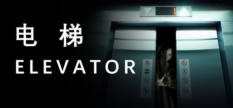
电梯 Elevator scores 72/100 — better than 42% of Early Access capsules (n=3,067).

Quick text summary

电梯 Elevator scored 72/100 on Steam Analyzer — Good for a Early Access capsule. Top priority fix: [uniqueness_polish] Introduce a visual hint of the 'different era' mechanic—such as subtle period-specific details in the elevator environment or anachronistic elements—to differentiate the game from generic elevator horror.

Capsule scores by dimension

  • Genre Clarity: 7/10 — Horror atmosphere clear, genre nuance subtle. The elevator setting with dramatic lighting and silhouetted figure strongly communicates psychological horror and confinement. At TINY size, the elevator doors and ominous atmosphere read as horror-adjacent, though the puzzle and adventure elements are less visually apparent. The eerie green-teal color palette and figure positioning support the genre claim effectively.
  • Title Readability: 8/10 — Bilingual title reads clearly at all sizes. The white Chinese characters (电梯) and English 'ELEVATOR' text are bold, high contrast, and well-spaced on the dark left side of the composition. Both FULL and SMALL sizes preserve legibility; at TINY size the text remains readable though slightly compressed. Strategic placement away from the busy elevator background ensures the title does not compete with the central image.
  • Contrast & Color: 8/10 — Strong value separation, cohesive cool palette. White title text pops sharply against the dark background, and the bright elevator interior with cool teal and cyan lighting creates excellent contrast against the black surroundings. The silhouetted figure and glowing button panel provide clear depth layering. In grayscale, the design maintains strong edge definition and silhouette clarity even at TINY size.
  • Uniqueness & Polish: 7/10 — Cohesive aesthetic, slight template familiarity. The elevator interior with moody lighting and trapped-figure concept is well-executed and thematically appropriate for a psychology horror game. The visual direction feels intentional and polished, though elevator-based horror is a familiar trope. The bilingual presentation adds a slight distinctive edge, but the overall execution sits comfortably in a familiar horror lane rather than breaking new visual ground.
  • Brand Consistency: 6/10 — Consistent mood, limited identity hook. The cool teal-cyan color palette and claustrophobic elevator setting are internally cohesive and align with the game's premise. However, without reference to store screenshots, there are no memorable character motifs, iconic symbols, or unique visual signatures that would make this capsule instantly recognizable as a distinct brand beyond 'elevator horror.' The aesthetic is competent but generic within the broader horror-game visual language.
  • Composition: 7/10 — Clear focal point, well-balanced hierarchy. The elevator interior anchors the center with strong visual depth, while the title occupies the left third without competing for attention. The composition has good breathing room and no dead zones. At SMALL and TINY sizes, the eye naturally reads the title first, then settles on the elevator—a logical hierarchy. Edge safety is maintained, though the right side of the elevator could benefit from slightly more padding for cropping resilience.

What works

  • High-contrast bilingual title. White Chinese and English text stands out clearly on dark background and remains legible down to TINY size.
  • Strong atmospheric lighting. Teal-cyan glow from the elevator and bright button panel create clear visual hierarchy and depth layering against black background.
  • Clear genre signaling. Silhouetted figure trapped in confined space immediately communicates psychological horror and confinement themes.

What hurts the capsule

  • Generic horror trope execution. Elevator-based horror is a familiar visual concept, and the capsule does not introduce a distinctive twist or memorable identity hook.
  • Limited visual storytelling. The capsule shows confinement and atmosphere but does not visually hint at the 'different eras' or puzzle-solving mechanic that differentiates the game.
  • Minimal brand identity markers. No iconic character, motif, or signature visual element that would be recognizable in future marketing materials or player memory.

Priority fixes

  1. [uniqueness_polish] Introduce a visual hint of the 'different era' mechanic—such as subtle period-specific details in the elevator environment or anachronistic elements—to differentiate the game from generic elevator horror.
  2. [genre_clarity] Add subtle UI or atmospheric elements that hint at the puzzle-solving aspect, such as cryptic symbols on the button panel or temporal distortion effects, to communicate the full gameplay scope.
  3. [brand_consistency] Develop a signature visual motif (icon, color shift, or character element) that can anchor future marketing and make the capsule more memorable and brandable.

Store copy priority fixes

  1. [hook_strength] Rewrite the opening to lead with a specific, visceral moment—e.g., 'The elevator lurches. Lights flicker. You don't remember how you got here—only that the floors outside are wrong.' This creates immediate unease and curiosity.
  2. [feature_communication] Add 1–2 concrete puzzle examples or gameplay moments—e.g., 'Decode cryptic messages left on walls,' 'Reconstruct memories from environmental clues,' 'Navigate shifting architecture'—to clarify what players will actually do.
  3. [uniqueness] Insert a specific differentiator—e.g., 'Each floor exists in a different time period, changing the puzzle logic and horror tone,' or 'Your choices determine which supernatural entities you encounter'—to explain why this game stands apart.
  4. [tone_match] Proofread and correct all grammatical errors ('You main goal' → 'Your main goal,' 'you lost deeper' → 'you delve deeper,' 'phenomana' → 'phenomena') to restore professional tone and immersive atmosphere.

Related guides

Steam app ID: 4203470 · Tags: Early Access, Psychological Horror, Puzzle, Immersive Sim, Escape Room