Marshmallow's Adventure scores 68/100 — better than 14% of Arcade capsules (n=3,765).

Quick text summary

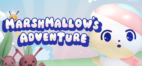
Marshmallow's Adventure scored 68/100 on Steam Analyzer — Solid for a Arcade capsule. Top priority fix: [genre_clarity] Add a visible weapon or enemy element to the composition to communicate the shooting mechanic and differentiate from cozy-only games.

Capsule scores by dimension

  • Genre Clarity: 7/10 — Cute adventure with unclear mechanics. The marshmallow character and pastel aesthetic clearly signal a cute indie adventure game. However, the visual does not communicate the shooting/combat mechanic described in the game description—there are no weapons, enemies, or action cues visible. At tiny size, it reads as a cozy mascot game rather than an action-oriented shooter.
  • Title Readability: 8/10 — Bold blue title, readable at all sizes. The large blue bubble text 'MARSHMALLOWS ADVENTURE' has strong contrast against the light sky background and maintains legibility at small and tiny sizes. The outline and thick letterforms prevent collapse, though the title placement is slightly high leaving some awkward space below. The small antenna icon above adds charm but is a minor distraction.
  • Contrast & Color: 7/10 — Good separation with warm pastels. The deep blue title pops well against the light blue-white gradient sky and cream-colored marshmallow character, providing clear value separation. The pink cheeks and green leaves add saturation variety. However, the overall palette is warm and soft with limited dark accents, which reduces edge definition at tiny sizes compared to high-contrast genre leaders like DREDGE or Lethal Company.
  • Uniqueness & Polish: 6/10 — Charming but generic cute indie aesthetic. The cute marshmallow mascot and pastel color scheme are well-executed and appealing, but they follow a common indie template seen in many cozy/adventure games. The composition feels more like a character introduction than a unique visual hook that communicates the core shooting mechanic. The craft is clean, but it does not stand out against the benchmark titles which each have a distinctive visual identity or narrative hook.
  • Brand Consistency: 6/10 — Consistent cute style, no iconic motif. The marshmallow character, pastel palette, and soft art style are internally cohesive and should carry across store pages. However, there is no iconic symbol, signature UI element, or memorable visual pattern that creates a strong brand fingerprint. The design is pleasant but not distinctively recognizable without the title text.
  • Composition: 7/10 — Clear focal point, slightly top-heavy. The marshmallow character's face is a strong primary focal point on the right side, with supporting background elements (leaves, berries) framing it naturally. The blue title dominates the upper half, creating a slightly unbalanced composition with significant empty space in the lower third. At tiny size the layout still reads clearly, but the vertical imbalance means less visual interest in the bottom region.

What works

  • Bold readable title. The large blue bubble text remains legible at all sizes including tiny thumbnails due to thick letterforms and strong outline contrast.
  • Clear cute character appeal. The marshmallow mascot with large eyes and warm smile creates immediate charm and establishes the game's tonal identity.
  • Cohesive pastel palette. The soft blue, cream, pink, and green color scheme is consistent, harmonious, and supports the cute indie brand.

What hurts the capsule

  • Misaligned genre messaging. The visual suggests cozy adventure but omits shooting, weapons, or combat visual cues that define the core gameplay loop.
  • Generic cute indie template. The composition and aesthetic closely follow common indie game visual patterns without a distinctive hook that differentiates it from similar titles.
  • Unbalanced vertical composition. Heavy title placement at top with empty space at bottom creates unused prime real estate and reduces visual engagement in the lower frame.

Priority fixes

  1. [genre_clarity] Add a visible weapon or enemy element to the composition to communicate the shooting mechanic and differentiate from cozy-only games.
  2. [composition] Rebalance the layout by repositioning the title or adding secondary visual elements in the lower half to create better vertical weight distribution.
  3. [uniqueness_polish] Introduce a signature visual motif or UI element (weapon icon, collectible, or HUD hint) that reinforces the shooting game identity and creates a memorable brand mark.

Store copy priority fixes

  1. [hook_strength] Rewrite the short description opening to lead with a clear verb and emotional payoff: 'Blast through endless waves of bugs as an adorable marshmallow in this casual roguelike shooter. Collect weapons and power-ups to survive and rank higher each run.'
  2. [feature_communication] Replace scattered feature mentions with a structured gameplay loop summary: 'Each run, defeat enemies to gain experience and unlock new weapons. Collect items for bonuses, rescue friends as permanent upgrades, and push further each attempt.'
  3. [uniqueness] Add a specific differentiator such as 'Unlike typical bullet-hells, Marshmallow's Adventure requires no timed reflexes—focus on strategy and exploration' or highlight a unique progression system that sets it apart.
  4. [genre_clarity] Replace 'log-like automatic shooting' with 'roguelike bullet-heaven shooter' or 'casual wave-based shooter' to use recognized genre terminology.

Related guides

Steam app ID: 4204950 · Tags: Arcade, Indie, Roguelike, Shoot 'Em Up, 2D