Scoring genre clarity...
Scoring genre clarity...
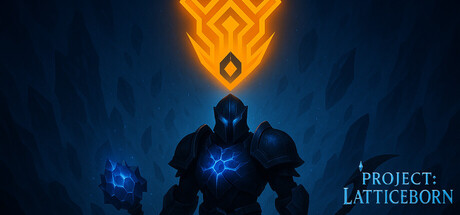
Project: Latticeborn scores 75/100 — better than 68% of Roguelike capsules (n=2,609).
$2.99 · Released Mar 8, 2026 · By Ilhan Kilinc
Project: Latticeborn scored 75/100 on Steam Analyzer — Good for a Roguelike capsule. Top priority fix: [uniqueness_polish] Introduce a visual element or character detail that hints at the roguelite progression loop (e.g., crystalline shards, weapon forging, or a distinctive Shardborn design trait) to differentiate from generic action game visuals.
Steam app ID: 4205190 · Tags: Roguelike, Action Roguelike, Action, Bullet Hell, Roguelite