Scoring genre clarity...

Starlit Bottle capsule

Starlit Bottle

Starlit Bottle is a casual stress-relief game themed around starry sky bottles.

Free to Play7 user reviews
CasualPoint & ClickMatch 3
Zhang HuiqinDec 12, 2025

Starlit Bottle scores 62/100 — better than 3% of Casual capsules (n=10,153).

7 user reviews · Free to Play · Released Dec 12, 2025 · By Zhang Huiqin

Quick text summary

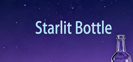
Starlit Bottle scored 62/100 on Steam Analyzer — Solid for a Casual capsule. Top priority fix: [genre_clarity] Add a visual hint of interaction or core mechanic—such as a player hand, bottle glow effect, or in-game UI element—to signal the stress-relief gameplay loop at tiny size.

Capsule scores by dimension

  • Genre Clarity: 5/10 — Ambiguous genre signals. The starry sky and bottle visual suggest a relaxation or puzzle theme, but lack clear gameplay indicators typical of stress-relief games. At tiny size, it reads as a generic night sky scene rather than communicating a specific casual game mechanic or interaction model.
  • Title Readability: 8/10 — Clear and well-positioned. The title 'Starlit Bottle' uses clean sans-serif typography with strong white-to-purple contrast and is positioned safely in the upper-center region on a controlled background. It remains legible at small and tiny sizes, though the tagline or secondary text is not present to clutter the hierarchy.
  • Contrast & Color: 7/10 — Solid value separation. The white title text pops well against the deep purple-to-navy gradient background with clear value separation. The bottle illustration in the lower right has adequate separation from the sky, though at tiny size the bottle outline becomes thin and slightly harder to distinguish from the background stars.
  • Uniqueness & Polish: 5/10 — Generic celestial aesthetic. The design is competent and cleanly executed with a starfield background and stylized bottle, but the visual approach is fairly common in casual/puzzle game marketing. The bottle illustration lacks a distinctive art style or memorable hook that would signal a unique gameplay experience beyond 'relaxing space theme.'
  • Brand Consistency: 6/10 — Thematic but not iconic. The starry bottle motif is internally consistent and directly tied to the title, establishing a cohesive visual theme. However, without additional brand identity cues (character, logo system, or signature palette variation), the design lacks a memorable iconic element that could be recognized across multiple capsules.
  • Composition: 6/10 — Balanced but conventional layout. The title sits in the upper-center zone with the bottle anchoring the lower-right corner, creating basic balance and safe margins. At tiny size, both elements remain visible, but the composition feels static and lacks depth layering—the starfield background does not create clear foreground, midground, foreground separation.

What works

  • Strong title contrast. White sans-serif text reads clearly against the purple-to-navy gradient at all sizes, with no competing visual noise behind the text block.
  • Safe layout margins. Title and bottle are positioned away from edges, reducing crop risk and maintaining readability when the capsule appears in Steam's various display formats.
  • Cohesive color palette. The purple-blue starfield, white typography, and bottle outline work together as a unified theme without jarring color breaks.

What hurts the capsule

  • Unclear gameplay identity. The starry bottle aesthetic does not visually communicate what stress-relief mechanics or interaction the player will experience, making genre intent ambiguous at small sizes.
  • Generic visual approach. The starfield night-sky template and decorative bottle illustration lack originality; this visual style is common across many casual and puzzle game capsules.
  • No brand identity anchor. The design lacks a distinctive character, logo, or signature motif that would make Starlit Bottle recognizable across multiple marketing touchpoints.
  • Thin bottle outline. The bottle stroke loses definition at tiny thumbnail size, blending slightly with background stars and reducing silhouette clarity.

Priority fixes

  1. [genre_clarity] Add a visual hint of interaction or core mechanic—such as a player hand, bottle glow effect, or in-game UI element—to signal the stress-relief gameplay loop at tiny size.
  2. [uniqueness_polish] Develop a distinctive art direction or character element that differentiates Starlit Bottle from generic starfield templates and communicates the unique selling point.
  3. [composition] Strengthen depth layering by introducing a clear foreground element or focal point interaction that draws the eye and creates visual hierarchy beyond the static bottle.
  4. [contrast_color] Thicken the bottle outline or add a subtle glow layer to ensure silhouette separation from background stars at thumbnail sizes.

Store copy priority fixes

  1. [hook_strength] Rewrite the short description to lead with the core interactive mechanic: 'Sort colorful water between bottles in this soothing puzzle game' or similar, then add the theme as a supporting detail.
  2. [uniqueness] Add a sentence explaining what makes Starlit Bottle visually or mechanically distinctive—e.g., art style, progression reward system, or how the starry sky theme integrates into gameplay.
  3. [feature_communication] Clarify the crafting mechanic mentioned in tags: is it a secondary system, cosmetic, or progression tool? Add 1–2 sentences explaining how it enhances the core loop.
  4. [genre_clarity] Explicitly mention 'Match 3' or 'color-matching puzzle' in the short description or first sentence of the detailed description to align with Steam tags and player expectations.

Related guides

Steam app ID: 4207670 · Tags: Casual, Point & Click, Match 3, 2D, Mystery