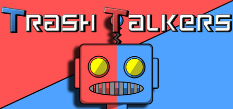
Trash Talkers scores 73/100 — better than 54% of Casual capsules (n=10,153).

Quick text summary

Trash Talkers scored 73/100 on Steam Analyzer — Good for a Casual capsule. Top priority fix: [genre_clarity] Add subtle visual storytelling elements such as speech bubbles, a referee figure, or competitive body language to hint at the trash-talk mechanic.

Capsule scores by dimension

  • Genre Clarity: 7/10 — Casual party game vibes clear. The split-screen robot face with exaggerated expressions and bold primary colors immediately signals a lighthearted, competitive casual game rather than action or narrative-driven content. At tiny size, the simplified robot silhouette and bright red-blue divide still read as playful and non-serious. The game mechanic (trash talk, 1v1 competition) is not visually obvious from the capsule alone, but the genre category lands correctly as casual/party.
  • Title Readability: 8/10 — Bold title readable at all sizes. The title 'Trash Talkers' uses thick, uppercase letterforms with a 3D beveled effect that maintains legibility across full, small, and tiny sizes. Letters are well-spaced and center-placed over the robot character, avoiding noisy backgrounds. At tiny size the words collapse slightly but remain decipherable; the 3D effect supports rather than hinders recognition at all viewing scales.
  • Contrast & Color: 8/10 — Strong primary color separation. The vibrant red and blue split background creates excellent value and hue separation against the dark Steam background #1b2838. The yellow robot eyes and black mouth details pop clearly against the colored panels. Grayscale squint test confirms the red-blue diagonal provides strong contrast separation, and the robot silhouette reads cleanly without mid-tone muddiness.
  • Uniqueness & Polish: 7/10 — Distinctive playful robot character. The split-personality robot mascot with exaggerated features and 3D beveled styling feels intentional and memorable, avoiding generic game scene tropes. The retro-digital robot design has personality and charm, though the overall execution is functional rather than exceptional compared to top-tier indie capsules. The concept hooks clearly but polish sits at solid rather than premium tier.
  • Brand Consistency: 6/10 — Simple iconic mascot, limited cues. The red-blue split robot face is distinctive and appears designed as the game's core mascot, supporting internal recognition potential. However, no other brand identity signals (UI style, typography consistency, thematic motifs) are clearly visible to reinforce this identity across multiple exposures. The mascot alone carries the brand weight without supporting visual language from screenshots or other materials evident here.
  • Composition: 8/10 — Centered focal point, clear hierarchy. The robot character anchors the composition dead-center with title text floating above, creating a natural visual hierarchy that reads immediately at small and tiny sizes. The diagonal red-blue background provides directional energy without clutter. Safe margins protect the focal point from Steam's edge cropping, and the design remains balanced and scannable even at 120x45 thumbnail resolution.

What works

  • Memorable mascot character. The split-face robot with bold expressions is distinctive, playful, and immediately recognizable as the game's brand identity.
  • Excellent color contrast. The vibrant red-blue divide pops strongly against Steam's dark background and maintains clarity in grayscale and at tiny sizes.
  • Legible typography at scale. The thick, beveled title remains readable from full size down to tiny thumbnail without collapse or loss of clarity.
  • Clean centered composition. The focal point hierarchy is clear with robot at center and title above, avoiding clutter and edge-crop risks.

What hurts the capsule

  • Limited genre mechanic visual cues. The capsule does not visually communicate the core 'trash talk' or 'convince referee' gameplay loop, relying on mascot charm alone.
  • Minimal supporting visual language. No UI elements, secondary characters, or thematic props reinforce brand identity beyond the central mascot robot.
  • Generic casual game aesthetic. While the robot is distinctive, the overall color block and 3D beveled style follows familiar indie casual templates seen in numerous genre peers.

Priority fixes

  1. [genre_clarity] Add subtle visual storytelling elements such as speech bubbles, a referee figure, or competitive body language to hint at the trash-talk mechanic.
  2. [uniqueness_polish] Introduce a secondary visual motif or UI style element that reinforces brand identity and distinguishes it from competing casual party games.
  3. [brand_consistency] Extend the robot mascot design language into background details or supporting characters to create a more cohesive visual identity system.

Store copy priority fixes

  1. [feature_communication] Add 1–2 sentences explaining how referees evaluate winners and whether criteria are subjective, skill-based, or score-driven—e.g., 'As the referee, you judge on wit, humor, and confidence. Your call is final.' This directly answers a player's primary concern.
  2. [uniqueness] Integrate the cyberpunk/robot theme into the game loop or atmosphere description—e.g., 'Compete in futuristic arenas as trash-talking robots' or explain how the setting reinforces the party game experience, not just the visual style.
  3. [feature_communication] List 2–3 additional features or progression hooks: cosmetics, chat packs, game variants, seasonal content, or stat tracking. This signals there is depth beyond the core 1-minute round.
  4. [audience_targeting] Add a brief sentence clarifying the skill/confidence level expected—e.g., 'No improv experience needed—just personality and a sense of humor' or 'Best with friends who love competitive banter.' This preps players for the social tone required.

Related guides

Steam app ID: 4210120 · Tags: Casual, Party Game, 3D, First-Person, Stylized