Scoring genre clarity...

Diluted capsule

Diluted

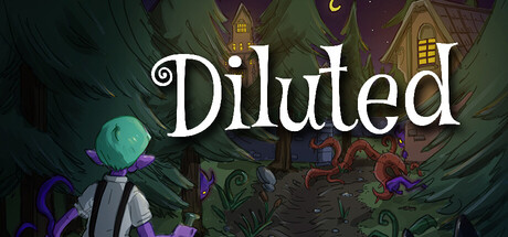
Diluted is a 3/4ths puzzle adventure-action game where nightmares seep into reality. Play as Archie, an orphan bound to a living nightmare, and uncover the truth behind his matron’s orphanage as you explore twisted forests and corrupted memories.

Free to PlayPositive(14)
AdventurePuzzleAction
MadDogProductionJan 1, 2026

Diluted scores 72/100 — better than 48% of Adventure capsules (n=7,922).

Positive (14 reviews) · Free to Play · Released Jan 1, 2026 · By MadDogProduction

Quick text summary

Diluted scored 72/100 on Steam Analyzer — Good for a Adventure capsule. Top priority fix: [uniqueness_polish] Introduce a distinctive character silhouette or pose (e.g., Archie's form) positioned prominently to create a memorable brand icon that differentiates from generic dark-fantasy competitors.

Capsule scores by dimension

  • Genre Clarity: 7/10 — Dark fantasy adventure with puzzle hints. The capsule communicates a twisted, dark fantasy setting through the corrupted architecture, purple/green color palette, and ethereal glowing orb positioned left of center. The orphan character and nightmare-bound narrative are visually implied through the eerie atmosphere and architectural decay, though at TINY size the specific 3/4ths puzzle-adventure mechanic is not immediately obvious from visuals alone—it reads more as dark action-adventure than puzzle-focused.
  • Title Readability: 8/10 — Clean white serif title, excellent contrast. The title 'Diluted' uses a clear white serif font positioned prominently in the upper-middle area with strong contrast against the dark background. The letterforms remain legible at SMALL and TINY sizes due to weight and simplicity. No tagline clutter impedes reading, and the placement on a relatively clear background band ensures resilience across all viewing scales.
  • Contrast & Color: 8/10 — Strong dark-light separation, cohesive palette. The capsule leverages high value contrast between the pure white title and the dark teal-green-purple background, creating excellent silhouette separation that holds at TINY size. The glowing cyan orb and purple architectural accents pop distinctly against the murky midtones, and grayscale conversion maintains clear distinction between foreground elements and background architecture.
  • Uniqueness & Polish: 7/10 — Polished dark aesthetic, modest originality. The execution is clean and cohesive with intentional lighting, layered depth, and a distinctive corrupted-fantasy art style that matches the game's nightmare theme. However, the dark corrupted-architecture visual hook is familiar within indie horror-adventure space (similar vibes to titles like Lies of P and Dredge), so while the craft is solid, the core concept feels slightly derivative rather than a bold standalone statement.
  • Brand Consistency: 6/10 — Thematic consistency, no strong icon. The internal palette, lighting style, and corrupted-fantasy theme are internally consistent and align with the game's nightmare-seeping narrative. However, there is no iconic character silhouette, motif, or signature color identity that would make this capsule immediately recognizable as 'Diluted' in isolation—the aesthetic is thematically sound but not distinctly branded compared to the benchmarked titles which often feature a protagonist or symbolic object.
  • Composition: 7/10 — Balanced focal areas, safe title placement. The composition uses a clear hierarchy with the title anchored in the upper-middle and the glowing orb and character silhouette creating depth and visual interest in the left-center area. The layout avoids dead space and title edge-hugging, with safe margins preserved at typical crop points. At SMALL and TINY sizes, the eye naturally follows the white text then the luminous orb, creating a coherent read, though the mid-background architecture becomes slightly busy at thumbnail scale.

What works

  • Title legibility across sizes. Clean white serif font with strong contrast remains readable at TINY size without any decorative degradation or shadow artifacts.
  • Atmospheric visual cohesion. The corrupted forest architecture, purple-teal palette, and glowing orb work together to establish a unified dark-fantasy nightmare aesthetic that matches the game's core theme.
  • Strong value contrast. High separation between title, glowing elements, and background ensures the capsule pops against Steam's dark background and maintains clarity in grayscale.

What hurts the capsule

  • Generic dark-fantasy visual hook. While well-executed, the corrupted-architecture-and-glowing-orb aesthetic feels familiar in indie horror-adventure space and lacks a distinctive character or symbol that would make the game immediately recognizable.
  • Limited brand iconography. No strong signature motif, iconic character pose, or memorable visual element emerges that would anchor brand identity and make this capsule stand out as uniquely 'Diluted' rather than a competent dark-fantasy scene.
  • Background complexity at thumbnail scale. The mid-ground architectural detail becomes slightly muddied at TINY size, reducing the clarity of environmental storytelling compared to the sharp title and foreground orb.

Priority fixes

  1. [uniqueness_polish] Introduce a distinctive character silhouette or pose (e.g., Archie's form) positioned prominently to create a memorable brand icon that differentiates from generic dark-fantasy competitors.
  2. [brand_consistency] Develop a signature visual motif (e.g., a symbolic object, color accent, or lighting effect unique to Diluted) that would allow recognition across multiple marketing materials.
  3. [composition] Simplify or reduce mid-ground architectural noise at TINY scale to ensure the primary focal point (orb and character) remains the clear visual anchor without competing detail.

Related guides

Steam app ID: 4211990 · Tags: Adventure, Puzzle, Action, Action-Adventure, Singleplayer