Scoring genre clarity...

Void Nebula capsule

Void Nebula

Void Nebula is a sci-fi roguelite deckbuilder where you battle foes, buy game-changing items and create stupid combos using cards you've created yourself.

StrategyRoguelikeDeckbuilding
CielesisOctober 2026

Void Nebula scores 70/100 — better than 28% of Strategy capsules (n=5,329).

Released October 2026 · By Cielesis

Quick text summary

Void Nebula scored 70/100 on Steam Analyzer — Good for a Strategy capsule. Top priority fix: [uniqueness_polish] Add a visual metaphor for 'stupid combos' or card mechanics—e.g., card-game UI elements, overlapping card silhouettes, or a combo chain effect around the robot to communicate the deckbuilder pitch at a glance.

Capsule scores by dimension

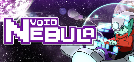
  • Genre Clarity: 7/10 — Sci-fi indie strategy clear. The robot character in red/orange with visible mechanical details and the space nebula background with purple cosmic particles establish sci-fi theme effectively. At tiny size, the robot silhouette and starfield remain identifiable, though the specific deckbuilder mechanic is not visually obvious—genre reads as space-action rather than strategy-focused at glance.
  • Title Readability: 8/10 — Bold pixelated text reads well. The title 'VOID NEBULA' uses thick, pixelated purple letterforms with white outline that maintain clarity from full size down to small thumbnail. The logo sits on a dark semi-transparent band that isolates it from the busy background, ensuring legibility even at tiny size where the distinct blocky serif style remains recognizable.
  • Contrast & Color: 8/10 — Strong purple and white pop. The purple and white title has excellent value separation against the dark space background, and the orange-red robot creates warm contrast against cool purple nebula tones. Silhouette separation is clean at all sizes; grayscale squint test shows the robot and text remain distinct from the background despite particle density.
  • Uniqueness & Polish: 6/10 — Competent but generic space theme. The pixelated retro aesthetic and robot character show craft, but the composition reads as a fairly standard sci-fi space template without a distinctive visual hook that communicates the deckbuilder mechanic or 'stupid combos' core pitch. The overall presentation is polished but does not stand out notably against genre-leading indie titles like Balatro or Hades II.
  • Brand Consistency: 6/10 — Consistent style lacks memorable motif. The purple-and-white pixelated art direction is applied consistently across the robot, text, and particle effects, creating internal cohesion. However, without reference to the six other screenshots, there are no clear iconic symbols, signature character poses, or distinctive palette cues that would immediately signal 'Void Nebula' in a scrolling list.
  • Composition: 7/10 — Clear hierarchy with safe layout. The robot character anchors the right side as primary focal point while the large centered title dominates upper-middle space, creating clear two-element hierarchy. The composition scales well to small and tiny sizes with no unsafe margin crops, though the busy particle field in background-left adds minor visual clutter that slightly competes for attention at tiny scale.

What works

  • Title legibility across all sizes. Thick pixelated letterforms with white outline and dark isolation band ensure 'VOID NEBULA' remains readable even at tiny thumbnail size.
  • Strong color contrast against Steam dark background. Purple title and orange robot create warm-cool separation that pops against #1b2838 and maintains distinction in grayscale.
  • Clean character silhouette and pose. The robot character is well-defined with clear mechanical detail and a dynamic action-ready stance that anchors visual interest.

What hurts the capsule

  • Generic sci-fi space template feel. The nebula background, robot, and particle effects read as a standard space-game aesthetic without a specific visual cue that communicates deckbuilder strategy or the game's unique 'stupid combos' mechanic.
  • Busy background particle field. The purple cosmic particles scattered across the left and center create visual noise that slightly reduces focus clarity at tiny size, competing with the title.
  • No distinctive brand identity motif. The capsule lacks an iconic symbol, character motif, or signature element that would make Void Nebula immediately recognizable in a scrolling genre list compared to top performers like Balatro or Hades II.

Priority fixes

  1. [uniqueness_polish] Add a visual metaphor for 'stupid combos' or card mechanics—e.g., card-game UI elements, overlapping card silhouettes, or a combo chain effect around the robot to communicate the deckbuilder pitch at a glance.
  2. [brand_consistency] Introduce a distinctive recurring symbol or visual hook (e.g., a unique nebula shape, card suit variant, or robot insignia) that can become the game's recognizable brand anchor across all store assets.
  3. [composition] Reduce or refine background particle density in the left-center area to increase title and robot focal point clarity without losing the cosmic atmosphere.

Related guides

  • Steam page optimisationCapsule, copy, screenshots, tags — the full Steam page conversion stack.
  • Steam tags guideTag selection, ordering, and how it shapes Steam's recommendation rails.

Steam app ID: 4212830 · Tags: Strategy, Roguelike, Deckbuilding, Singleplayer, Roguelite