Scoring genre clarity...

Captain Duck capsule

Captain Duck

Captain Duck is a turn-based crafting adventure set on the legendary island El Dorado. Choose actions from a random card-based map, gather resources, craft gear, and grow stronger. Simple to play, deep to master.

$4.99Positive(18)
StrategySurvivalAdventure
StudioShimazuFeb 26, 2026

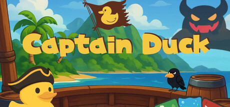
Captain Duck scores 75/100 — better than 69% of Strategy capsules (n=5,103).

Positive (18 reviews) · $4.99 · Released Feb 26, 2026 · By StudioShimazu

Quick text summary

Captain Duck scored 75/100 on Steam Analyzer — Good for a Strategy capsule. Top priority fix: [genre_clarity] Add a subtle card or strategy element (e.g., deck outline, resource icons, or map-grid overlay) to hint at the turn-based card-crafting mechanic and differentiate from generic adventure games.

Capsule scores by dimension

  • Genre Clarity: 7/10 — Casual adventure with clear tropical setting. The image immediately signals a lighthearted adventure game through the cartoon art style, tropical island setting with palm trees, cheerful yellow duck protagonist, and whimsical enemy character (the horned devil-like creature). At tiny size, the duck silhouette and island environment remain recognizable, though the card-based strategy mechanic is not visually apparent from the capsule alone. The casual, colorful aesthetic aligns with indie adventure/simulation expectations, though genre specificity (turn-based crafting) requires reading the title or description.
  • Title Readability: 8/10 — Bold yellow title reads clearly at all sizes. The 'Captain Duck' title is rendered in large, bright yellow uppercase letters with clean black outline positioned prominently across the upper-middle portion of the composition. The high contrast against the sky background and substantial letterform size ensure legibility at small and tiny sizes without collapse. The outline treatment provides additional insurance against background bleed, making this a strong typographic choice for Steam's viewing conditions.
  • Contrast & Color: 8/10 — Vibrant palette with strong value separation. The bright blue sky, yellow text, golden duck, and warm brown wood tones create excellent value contrast against Steam's dark #1b2838 background. The foreground elements (duck, title, barrel, wooden rail) are clearly separated from the soft-focus midground and sky, and the color saturation is controlled without feeling garish. At tiny size, the yellow duck and title pop distinctly while maintaining compositional cohesion; grayscale conversion shows solid light-dark separation throughout.
  • Uniqueness & Polish: 7/10 — Polished cartoon style, familiar game aesthetic. The execution is clean with consistent illustration quality, smooth curves, intentional shading, and professional color grading typical of competent indie games. The scene composition and character design feel intentional and branded rather than templated. However, the tropical island adventure with cute mascot character is a well-trodden visual archetype in indie casual games (similar DNA to Unpacking, Dinkum, Spiritfarer visual language), so while well-crafted, it lacks a truly distinctive hook that separates it from peer capsules in the casual-adventure space.
  • Brand Consistency: 7/10 — Consistent art direction, iconic duck mascot. The capsule demonstrates strong internal cohesion with a unified cartoon illustration style, consistent warm-to-cool color palette (golds, blues, greens), and a memorable duck protagonist that likely serves as the game's visual anchor. The tropical island setting and whimsical character design create recognizable identity cues. Without access to the 6 store screenshots, the consistency score is based on the capsule's internal coherence; the illustrated style and character design appear distinctive enough to serve as brand markers across promotional materials.
  • Composition: 8/10 — Clear focal point, balanced depth layering. The yellow duck in the lower-left quadrant serves as the primary focal point, supported by the large title above and the secondary antagonist (horned creature) in the upper right, creating a triangulated composition that guides the eye naturally. The depth layers—wooden rail foreground, character midground, island/sky background—establish clear spatial separation and visual hierarchy. At small and tiny sizes, the duck and title remain the dominant readable elements; the composition is resilient to cropping and does not rely on edge-hugging or unsafe margin placement.

What works

  • Strong yellow-on-sky title contrast. Bold, black-outlined 'Captain Duck' text maintains excellent legibility across all viewing sizes without typographic collapse.
  • Clear visual hierarchy and focal point. The yellow duck and prominent title immediately direct attention; supporting elements reinforce rather than compete for focus.
  • Polished, cohesive illustration style. Consistent cartoon rendering, intentional shading, and smooth curves communicate production quality and intentional art direction.
  • Resilient composition across sizes. Elements are well-positioned within safe margins; the design does not suffer from unsafe cropping or awkward scaling at small thumbnails.

What hurts the capsule

  • Familiar casual-adventure visual archetype. The tropical island setting with cute mascot character echoes numerous successful indie games, reducing distinctiveness on crowded store shelves despite solid execution.
  • Core mechanic not visually communicated. The card-based, turn-based strategy system that differentiates Captain Duck is entirely absent from the capsule; players cannot infer gameplay uniqueness from visuals alone.
  • Limited atmospheric context for El Dorado premise. The generic tropical island feels like stock casual-game scenery rather than the legendary, treasure-filled El Dorado promised by the description.

Priority fixes

  1. [genre_clarity] Add a subtle card or strategy element (e.g., deck outline, resource icons, or map-grid overlay) to hint at the turn-based card-crafting mechanic and differentiate from generic adventure games.
  2. [uniqueness_polish] Introduce a distinctive visual motif or artifact (El Dorado gold ruin, ancient temple, treasure map texture) that signals the legendary setting and elevates beyond standard tropical scenery.
  3. [composition] Consider repositioning the secondary antagonist or adding a crafted item/gear visual to the scene to reinforce the crafting narrative and create stronger visual storytelling about gameplay depth.

Store copy priority fixes

  1. [hook_strength] Rewrite the short description to open with an action verb and emotional hook: "Survive, craft, and strategize your way to El Dorado's treasures in this turn-based roguelike" or similar, leading with the core appeal before naming the game.
  2. [uniqueness] Add 1–2 sentences to the detailed description explaining what differentiates Captain Duck's crafting or card-based system (e.g., "Every tool you craft fundamentally alters how you explore" or "A roguelike where your strategy compounds across runs").
  3. [feature_communication] Clarify run structure and progression: add a sentence explaining whether runs are 30 minutes or 3 hours, and whether players unlock permanent upgrades or discover new mechanics on subsequent runs.
  4. [audience_targeting] Reconcile the "limited time" messaging with "very difficult": either reframe one, or clarify that difficulty is optional or scales, so both casual and hardcore players feel addressed.

Related guides

  • Steam page optimisationCapsule, copy, screenshots, tags — the full Steam page conversion stack.
  • Steam tags guideTag selection, ordering, and how it shapes Steam's recommendation rails.

Steam app ID: 4222360 · Tags: Strategy, Survival, Adventure, Simulation, Crafting