Pixelance scores 75/100 — better than 74% of Adventure capsules (n=7,922).

Quick text summary

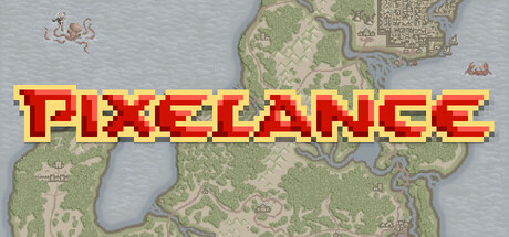
Pixelance scored 75/100 on Steam Analyzer — Good for a Adventure capsule. Top priority fix: [uniqueness_polish] Add a distinctive character sprite or creature silhouette in the foreground to create a memorable focal point and establish player connection beyond the generic map.

Capsule scores by dimension

  • Genre Clarity: 8/10 — Clear retro RPG adventure signals. The pixel art style, fantasy map background with terrain features, and classic RPG visual language immediately signal a turn-based adventure game. At tiny size, the retro aesthetic and map elements remain recognizable as an indie fantasy RPG, though specific roguelike mechanics are not visually conveyed.
  • Title Readability: 9/10 — Excellent bold pixel typography. PIXELANCE uses thick, high-contrast yellow text with red shadow on a neutral gray-blue background, ensuring maximum legibility at all sizes. The title remains sharp and readable at tiny size due to the bold letterform weight and clear color separation from the background.
  • Contrast & Color: 8/10 — Strong value separation throughout. The bright yellow title pops strongly against the muted blue-gray background and terrain map, with the red shadow adding further depth. At tiny size, the yellow-on-gray contrast holds well and the silhouettes remain distinct, though the map detail becomes softer.
  • Uniqueness & Polish: 6/10 — Competent retro style, generic execution. While the pixel art aesthetic is well-executed and thematic, the composition relies heavily on a standard fantasy overworld map without distinctive visual storytelling or a clear hook that differentiates Pixelance from other retro RPGs. The capsule communicates 'fantasy RPG' effectively but lacks a memorable unique selling point or standout moment.
  • Brand Consistency: 7/10 — Consistent pixel art direction. The retro pixel art style, terrain palette of greens and earth tones, and classic fantasy cartography are cohesive and suggest a unified art direction. The iconic title treatment with yellow and red could serve as a recognizable brand element, though the map background is generic enough to feel somewhat interchangeable with other fantasy RPGs.
  • Composition: 7/10 — Balanced layout with clear focal point. The title dominates the center with the fantasy map as supporting background texture, creating a clear hierarchy where the title is the primary focus. The composition works well at small and tiny sizes, though the map details fade into texture at the smallest size, which appropriately keeps focus on the bold title treatment.

What works

  • Bold readable title. Yellow pixel-art text with red shadow maintains excellent legibility across all viewing sizes and stands out sharply against the neutral background.
  • Cohesive retro aesthetic. The pixel art style is consistent and authentic to the game's identity, creating a unified visual presentation.
  • Effective contrast hierarchy. The bright yellow-on-gray color scheme ensures the title pops against the dark Steam background while the muted map recedes appropriately.

What hurts the capsule

  • Generic map background. The fantasy terrain tiles and overworld map are visually competent but lack distinctive visual storytelling or unique art direction that would make this capsule memorable.
  • No character or creature presence. The absence of a player character, enemy, or iconic figure means there is no human relatable element or visual protagonist to anchor player interest.
  • Missing roguelike identity signals. While the title and map suggest RPG, there are no visual cues that communicate permadeath, dungeon crawling, or the roguelike progression loop that is core to the game's appeal.

Priority fixes

  1. [uniqueness_polish] Add a distinctive character sprite or creature silhouette in the foreground to create a memorable focal point and establish player connection beyond the generic map.
  2. [genre_clarity] Incorporate visual elements such as a dungeon entrance, skull icons, or run-reset UI motifs that communicate the roguelike permadeath mechanic and dungeon focus.
  3. [composition] Layer a dynamic character pose or iconic enemy creature over the map to create depth and establish a clear protagonist while maintaining title prominence.

Store copy priority fixes

  1. [hook_strength] Rewrite the opening to lead with a compelling reason to play Lance's story: 'Pixelance is a turn-based roguelike where every death is final—explore vast kingdoms, recruit allies, and uncover the mysteries threatening the realm in this classic pixel adventure.'
  2. [uniqueness] Add one concrete differentiator: specify what makes the two episodes structurally or thematically distinct, or explain a unique mechanic (e.g., 'permadeath reshapes the story,' 'party composition unlocks hidden questlines').
  3. [feature_communication] Expand on what makes turn-based combat engaging: mention enemy variety, tactical depth, or itemization without jargon.
  4. [audience_targeting] Signal intended difficulty and narrative tone: clarify whether this is story-driven with combat, or combat-driven with light story, and hint at whether it rewards planning or adapts to improvisation.

Related guides

Steam app ID: 4224610 · Tags: Adventure, RPG, Action Roguelike, Action-Adventure, Dungeon Crawler