Scoring genre clarity...

GRIDBUSTERS capsule

GRIDBUSTERS

A logic deduction game. Read the grid. Deduce, don't guess. Bust the case.

$4.99No user reviews
LogicPuzzleInvestigation
Jion InteractiveApr 29, 2026

GRIDBUSTERS scores 82/100 — better than 94% of Logic capsules (n=1,408).

No user reviews · $4.99 · Released Apr 29, 2026 · By Jion Interactive

Quick text summary

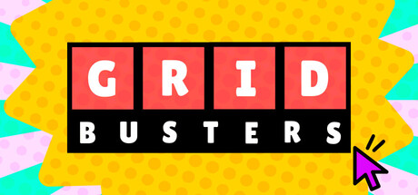
GRIDBUSTERS scored 82/100 on Steam Analyzer — Good for a Logic capsule. Top priority fix: [genre_clarity] Consider adding a subtle grid pattern or logic-puzzle visual cue (e.g., filled/empty cells, clue marks) within or around the letter blocks to reinforce the deduction mechanic and differentiate from generic word games.

Capsule scores by dimension

  • Genre Clarity: 7/10 — Casual puzzle game signaled clearly. The bright, playful color palette and grid-based letter blocks immediately suggest a casual logic or word puzzle game. The colorful geometric background with triangular shapes reinforces a lighthearted, indie aesthetic. At tiny size, the grid structure and bold typography still read as puzzle-game related, though the specific deduction mechanic is not visually explicit.
  • Title Readability: 9/10 — Excellent legibility at all sizes. GRIDBUSTERS uses a clean, heavy sans-serif font with strong white letterforms on contrasting red and black blocks, ensuring perfect readability from full header down to tiny thumbnail. The two-line layout with letter blocks above and solid black bar below creates a structured, iconic mark that does not collapse at any size. Strategic placement on controlled background regions maintains clarity throughout all viewing conditions.
  • Contrast & Color: 9/10 — Strong vibrant pop against dark Steam background. The bright yellow background, saturated red letter blocks, and pure white text create exceptional value separation and visual punch against Steam's #1b2838 dark interface. The cyan and pink geometric accents add further pop and saturation without muddying the palette. In grayscale, the white-on-red and white-on-black contrast remains sharp and silhouette-clean, ensuring legibility in quick scroll.
  • Uniqueness & Polish: 8/10 — Distinctive bold graphic identity. The retro arcade-inspired grid letter block design with the cursor pointer accent feels premium and intentional, not generic. The color coordination between letter blocks, background, and accent shapes demonstrates thoughtful art direction and a cohesive visual hook. However, the design, while polished and memorable, follows a recognizable retro-casual aesthetic rather than introducing a wholly original visual concept.
  • Brand Consistency: 7/10 — Coherent internal palette and style. The capsule presents a unified color story: saturated primaries (yellow, red, cyan, pink, black, white) applied consistently across logo, background, and accent elements. The retro block typography and geometric shapes create a recognizable visual identity for the brand. Internal consistency is strong, though without reference to in-game UI or character design, it is difficult to confirm alignment with broader brand systems referenced in the six available screenshots.
  • Composition: 9/10 — Clear hierarchy with perfect focal point. The title occupies the dominant center position with a strong clear hierarchy: the red letter blocks command primary attention, the black BUSTERS bar anchors below, and the yellow field provides active supporting color. The cursor pointer in the bottom right acts as a purposeful accent without competing for focus. Safe margins are well observed, and the composition remains balanced and purposeful at small and tiny sizes without awkward cropping or dead space.

What works

  • Iconic, instantly recognizable mark. The grid letter block design with retro arcade styling is distinctive and memorable enough to stand out in the casual indie game space.
  • Perfect legibility across all sizes. Heavy letterforms, controlled backgrounds, and strong contrast ensure GRIDBUSTERS reads cleanly at full, small, and tiny scales without degradation.
  • Vibrant, saturated color palette. Primary colors and high-contrast accents pop dramatically against Steam's dark background and maintain separation in grayscale.
  • Intentional, cohesive visual design. Every element—typography, geometric shapes, cursor accent—feels deliberately placed and supports a unified retro-casual aesthetic.

What hurts the capsule

  • Limited visual storytelling of core mechanic. While the grid design hints at puzzle gameplay, the capsule does not visually communicate the deduction or logic-puzzle aspect central to the game.
  • Retro style may feel familiar. Though well-executed, the arcade-inspired block aesthetic is a recognizable design trope in casual gaming and may not feel entirely unique.

Priority fixes

  1. [genre_clarity] Consider adding a subtle grid pattern or logic-puzzle visual cue (e.g., filled/empty cells, clue marks) within or around the letter blocks to reinforce the deduction mechanic and differentiate from generic word games.
  2. [brand_consistency] Cross-reference this capsule design against in-game UI, menu screens, and character styling from the six available screenshots to ensure visual alignment and confirm this logo would be recognizable as the game's brand in store context.

Store copy priority fixes

  1. [hook_strength] Rewrite the short description to open with the satisfaction mechanic: 'Solve handcrafted logic puzzles through pure deduction—every correct answer unlocks the next piece.' This leads with the emotional payoff rather than just the action.
  2. [feature_communication] Add a structured features section after the short description listing: '20+ handcrafted cases, Grid-based spatial deduction, Cascading reveals (no dead ends), Multiple clue types (neighbors, patterns, positions)' to make the feature set scannable.
  3. [audience_targeting] Add one sentence explicitly calling out accessibility: 'Designed for relaxed play with extensive accessibility options including keyboard-only, color alternatives, and playable without timed input.' This signals inclusivity to a wider audience.
  4. [uniqueness] Add a comparative sentence to the detailed description clarifying what makes this different: 'Unlike games that reward trial-and-error, every puzzle is built so that logical deduction is the only path to the solution.' This makes the differentiation explicit.

Related guides

Steam app ID: 4226820 · Tags: Logic, Puzzle, Investigation, Relaxing, Casual