Scoring genre clarity...
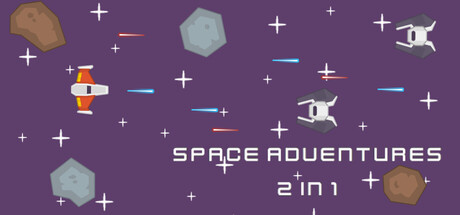
Space Adventures 2 in 1 is a collection of arcade-style space shooter games taking inspiration from classic arcade games. Both game modes focus on quick movement and reflexes, maintaining a retro-like feeling, featuring cartoonish sprites and sounds, and are designed for short, replayable sessions.
$7.99
SpaceCasualAdventure
Voidfeather GamesDec 24, 2025