Scoring genre clarity...
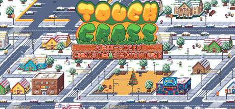
Christmas is here! Play the Christmas carols in your snowy neighborhood to earn enough cash to buy the new GameStation 2 before the day ends, upgrade your gear, complete quests, play snowball fights and spend your coins in the arcades to get a high score in Boxerino, a fast-paced sokoban-style game!
$3.99
2DTop-DownCasual
EXOFRENON GAMESDec 23, 2025