Scoring genre clarity...

Error: Girlfriend Not Found capsule

Error: Girlfriend Not Found

One-room cyberpunk VN about doubt, guilt and memory. Talk to a girl who claims to be your girlfriend, question reality, and unlock multiple endings in a short, replayable psychological story.

$0.99Positive(12)
CasualVisual Novel2D
Byte Me StudiosDec 22, 2025

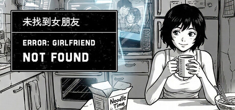
Error: Girlfriend Not Found scores 67/100 — better than 15% of Casual capsules (n=10,153).

Positive (12 reviews) · $0.99 · Released Dec 22, 2025 · By Byte Me Studios

Quick text summary

Error: Girlfriend Not Found scored 67/100 on Steam Analyzer — Solid for a Casual capsule. Top priority fix: [title_readability] Increase Chinese text size or relocate it to a position where it remains readable at small capsule size (231×87), or consider removing it if English title is the primary market language.

Capsule scores by dimension

  • Genre Clarity: 7/10 — Cyberpunk VN with psychological tension. The monochrome sketch art style, futuristic kitchen setting with visible tech, and centered female character clearly signal a visual novel. The error text and questioning tone immediately establish psychological/mystery gameplay. At tiny size, the character silhouette and tech-laden environment read as indie cyberpunk VN, though the genre specificity (narrative-driven, choice-heavy) requires the error message to be legible to fully land the psychological hook.
  • Title Readability: 5/10 — Mixed readability across sizes. The English title 'ERROR: GIRLFRIEND NOT FOUND' reads clearly at full size with strong white contrast on black bar, but the Chinese text above (未找到女朋友) becomes illegible at small and tiny sizes due to character density and small point size. The error message text is the functional title but sits in a crowded black bar that competes with the character art below, risking poor hierarchy at thumbnail sizes.
  • Contrast & Color: 8/10 — Strong monochrome contrast and silhouettes. Pure black-and-white linework creates excellent separation against the Steam dark background (#1b2838), with crisp character silhouette and kitchen details reading clearly even at tiny sizes. The high-contrast pen illustration style ensures no muddy mid-tones; every element pops through value separation alone. Grayscale performance is inherently excellent since the entire design is already grayscale.
  • Uniqueness & Polish: 7/10 — Distinctive sketch aesthetic, generic composition. The hand-drawn monochrome manga/comic book style is visually distinctive and immediately separates it from glossy AAA capsules, signaling indie pedigree and artistic intent. However, the posed seated character in a room is a familiar visual novel trope, and there is no unique visual hook that communicates the specific 'psychological doubt and memory' core mechanic—it reads as a standard VN scene rather than something that hints at unreliability or disorientation.
  • Brand Consistency: 6/10 — Coherent art style, minimal identity markers. The monochrome sketch style is internally consistent and clean, with no jarring shifts in rendering or palette. However, there are no distinctive brand icons, signature colors, or recurring visual motifs that would make this capsule immediately recognizable as 'Error: Girlfriend Not Found' vs. another monochrome VN. The girl character could be the iconic mascot, but her generic pose and face offer limited memorability cues.
  • Composition: 7/10 — Clear hierarchy, tight layout. The character occupies the right-center focal point with strong silhouette, while the error text banner anchors the upper-left, creating diagonal visual flow that avoids dead center void. The kitchen background provides depth without clutter, supporting the character as primary subject. At small/tiny sizes the composition holds, though the text bar and character compete slightly for attention and could benefit from clearer foreground-midground separation to ensure the error message doesn't feel grafted on.

What works

  • Excellent value contrast and readability. Pure monochrome linework guarantees crisp silhouettes and legibility against the Steam dark background across all viewing sizes, making the character and setting instantly identifiable even at thumbnail scale.
  • Distinctive hand-drawn art style. The manga-influenced sketch aesthetic immediately signals indie creative ambition and visual storytelling, standing apart from photorealistic or vector-based competitors.
  • Focused single-character composition. The centered girl silhouette creates a clear focal point with balanced depth layers (background kitchen, midground character, foreground text), avoiding visual scatter.

What hurts the capsule

  • Chinese title illegible at small/tiny sizes. The upper text (未找到女朋友) becomes unreadable below small capsule size due to character density, forcing English-only recognition and potentially alienating the Chinese-speaking audience in Steam browsing.
  • Generic VN pose and setting. The seated character in a room is a familiar visual novel cliché that does not visually hint at the game's unique psychological/memory-doubt mechanic, making the capsule feel like a standard VN rather than something distinctive.
  • No iconic brand symbol or recurring motif. The girl character and error message are functional but not distinctive enough to create lasting visual brand recognition; there is no signature icon, logo, or color palette that would make this capsule stand out on a shelf of other monochrome indie games.
  • Text bar competes with character focus. The black error message banner at the top splits visual hierarchy with the character rather than clearly subordinating to it, creating slight tension between title and subject at small sizes.

Priority fixes

  1. [title_readability] Increase Chinese text size or relocate it to a position where it remains readable at small capsule size (231×87), or consider removing it if English title is the primary market language.
  2. [genre_clarity] Add a subtle visual cue that hints at unreality, memory distortion, or uncertainty—such as a glitch effect on part of the character, doubled image, or fragmented kitchen—to visually communicate the psychological-doubt core mechanic.
  3. [uniqueness_polish] Introduce a signature color accent (such as a neon hue reflecting off the character or environment) or iconic prop (e.g., a distinctive object related to memory or the error theme) to create a memorable brand identifier.
  4. [composition] Revise the text banner layout to sit lower or integrate it as an overlay that clearly subordinates to the character silhouette, ensuring the girl remains the undisputed focal point at all sizes.

Store copy priority fixes

  1. [feature_communication] Add a brief sentence explaining what dialogue choices feel like—e.g., 'every accusation, every memory you challenge locks you into a new path' to clarify the consequence system.
  2. [uniqueness] Expand on what 'push against the seams of reality' means mechanically—does the environment break visually? Does dialogue change? A concrete example would strengthen differentiation.
  3. [audience_targeting] Consider a phrase explicitly signaling length and replayability value, e.g., 'A 90-minute experience that demands a second playthrough' to help players gauge investment.

Related guides

Steam app ID: 4229050 · Tags: Casual, Visual Novel, 2D, Atmospheric, Dark