Scoring genre clarity...

Special Meat capsule

Special Meat

Welcome to a world of cannibals! Dissect bodies, separate bones, and turn every gram into profit. Featuring fully manual mechanics, a grim atmosphere, and relentless orders. Leave your morals at the door. Just chop.

SimulationHorrorVillain Protagonist
Untitle Game StudioQ4 2026

Special Meat scores 72/100 — better than 40% of Simulation capsules (n=5,401).

Released Q4 2026 · By Untitle Game Studio

Quick text summary

Special Meat scored 72/100 on Steam Analyzer — Good for a Simulation capsule. Top priority fix: [contrast_color] Introduce a strategic accent color (e.g., deep red or sickly green tint to the grid or cleaver reflection) to increase visual pop and differentiation from other dark-toned capsules.

Capsule scores by dimension

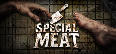
  • Genre Clarity: 7/10 — Dark butchery simulation clearly conveyed. The image immediately communicates a grotesque, violent butchery theme through the severed hands, cleaver, and grid background suggesting a meat preparation surface. At tiny size, the cleaver and hands remain recognizable enough to signal a dark, grimdark game mechanic, though the specific simulation genre (rather than action game) is less obvious without context. The visual hierarchy strongly implies dismemberment and corpse handling gameplay.
  • Title Readability: 8/10 — Bold white text reads cleanly across scales. The title 'SPECIAL MEAT' is rendered in a large, heavy sans-serif font with strong white contrast against the darker background, maintaining legibility at full, small, and tiny sizes. The text placement in the center-lower portion avoids the busy hands above, creating a controlled reading zone. At tiny size the letterforms remain distinct and the two-word structure compresses predictably without losing shape.
  • Contrast & Color: 8/10 — High-value separation with strong silhouettes. The pale skin tones and white title create excellent value separation against the dark grid background and murky tones, passing the grayscale test with clear edge definition. The metallic cleaver blade reflects light and reads as a distinct bright element even at small scale. In quick scroll, the bright hand silhouettes and bold title immediately catch attention against the Steam dark background #1b2838.
  • Uniqueness & Polish: 7/10 — Memorable dark concept with effective execution. The cannibalism-focused simulation angle is genuinely distinctive and the cleaver-and-hands visual hook communicates the core mechanic premise effectively without generic scene-setting. The photorealistic rendering of hands and grid texture suggests production care, though the concept itself carries the memorability rather than exceptional artistic polish. Compared to the genre benchmarks, it stands out thematically but lacks the visual refinement of top performers like Dredge or Hades II.
  • Brand Consistency: 6/10 — Dark butchery aesthetic consistently applied. The image establishes a cohesive grimdark butchery brand identity through the grid floor, raw hands, and industrial cleaver without jarring tonal shifts. The photorealistic rendering style and desaturated color palette signal consistency, though without viewing all 7 store screenshots, distinctive character archetypes, recurring motifs, or signature visual signatures are not confirmed. The grim, utilitarian aesthetic would likely be recognizable across marketing materials based on this foundation.
  • Composition: 7/10 — Balanced focal point with clear hierarchy. The cleaver and hands form a natural focal point in the upper-center area, drawing the eye inward, while the title anchors the lower half without competing for attention. The grid background provides texture without visual noise, and the two-level depth (hands/cleaver above, text below) creates clear read hierarchy at all sizes. At tiny size the composition holds together, though some fine hand detail may blur slightly in the edges.

What works

  • Title pops with excellent contrast. White sans-serif text maintains sharp readability from full to tiny size against the dark background.
  • Distinctive dark concept premise. Cannibalism simulation hook immediately signals this is not a generic game, creating memorable brand recognition.
  • Clear visual hierarchy and composition. Hands and cleaver occupy upper focal zone, title grounds lower zone, creating natural eye flow without competition.
  • Value separation passes grayscale test. Pale hands and bright cleaver maintain clear silhouettes even in desaturated viewing, supporting quick-scroll recognition.

What hurts the capsule

  • Genre subtype ambiguity at tiny size. While the dark violence reads clearly, the simulation/business mechanics are not visually obvious without the description context.
  • Hand detail may soften at small scale. Photorealistic skin texture and fine anatomical details could blur slightly when the capsule shrinks, reducing visual impact.
  • Limited color palette may feel flat. The desaturated browns, grays, and single-note white do not create visual pop compared to more vibrant indie game capsules in benchmarks.

Priority fixes

  1. [contrast_color] Introduce a strategic accent color (e.g., deep red or sickly green tint to the grid or cleaver reflection) to increase visual pop and differentiation from other dark-toned capsules.
  2. [uniqueness_polish] Refine the cleaver blade highlights or add a subtle glow effect to make the primary tool feel more premium and visually distinctive at small sizes.
  3. [composition] Ensure hand positioning and edge cropping leave safe margins so no critical details are cut during Steam display resizing.

Related guides

Steam app ID: 4233030 · Tags: Simulation, Horror, Villain Protagonist, Management, Dark