Scoring genre clarity...

Sort Pawzzle 2: By the Purrthenon capsule

Sort Pawzzle 2: By the Purrthenon

Sort picture tiles with a charming kitty and explore calming Greek landscapes. Restore beautiful landmarks and enjoy a gentle, relaxing puzzle adventure. Includes free access to the first 25 levels.

Free to Play2 user reviews
CasualPuzzle2D
Best Place AppsMar 20, 2026

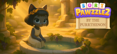
Sort Pawzzle 2: By the Purrthenon scores 75/100 — better than 65% of Casual capsules (n=10,153).

2 user reviews · Free to Play · Released Mar 20, 2026 · By Best Place Apps

Quick text summary

Sort Pawzzle 2: By the Purrthenon scored 75/100 on Steam Analyzer — Good for a Casual capsule. Top priority fix: [title_readability] Remove or redesign the tan subtitle—either eliminate 'BY THE PURRTHENON' or increase its contrast and letter size to maintain readability at thumbnail scale.

Capsule scores by dimension

  • Genre Clarity: 8/10 — Casual puzzle with charming character. The cute black cat sitting in a serene pool environment with golden Greek architecture clearly signals a relaxing, character-driven casual game. At tiny size, the distinctive cat silhouette and warm, peaceful setting remain readable and immediately convey a wholesome puzzle experience rather than action or competitive gameplay.
  • Title Readability: 7/10 — Logo readable, tagline weak at tiny. The colorful 'SORT PAWZZLE2' logo at top right is bright, well-spaced, and maintains legibility at small sizes due to high saturation and contrast against the darker background. However, the tan subtitle 'BY THE PURRTHENON' becomes difficult to parse at tiny size due to lower contrast and small letterforms, creating a secondary readability issue.
  • Contrast & Color: 8/10 — Warm glow pops effectively. The golden-yellow ambient lighting creates strong value separation from the dark Steam background (#1b2838), and the cat's dark silhouette contrasts sharply against the bright pool and architecture. The warm color palette feels cohesive and inviting even at small sizes, with clear edge definition on the main character and environmental elements.
  • Uniqueness & Polish: 7/10 — Polished aesthetic with appealing hook. The stylized 3D cat character, soft lighting, and Greek-inspired environment feel intentionally crafted and premium compared to generic puzzle templates. The visual storytelling—a cute cat in a calming Greek setting—effectively communicates the game's core appeal, though the concept does align closely with trending casual-cozy game aesthetics seen in comparable titles.
  • Brand Consistency: 7/10 — Cohesive art style, recognizable mascot. The black cat serves as a memorable character anchor with a consistent, stylized design that could be recognized across marketing materials, and the warm golden-Greek aesthetic establishes a clear visual identity. Internal rendering and color palette feel unified, though the brand identity leans on familiar cozy-game tropes rather than a completely distinctive signature.
  • Composition: 8/10 — Strong focal point, balanced layout. The cat is positioned as the clear primary focal point in the left-center area, drawing the eye immediately while the Greek architecture frames the scene in supporting roles. The title logo sits cleanly in the top-right safe zone away from edge cropping, and depth layering (cat, pool, columns, distant mountains) creates visual separation that remains readable at small sizes without clutter.

What works

  • Character-driven focal point. The black cat is instantly recognizable and engaging at all sizes, serving as a memorable mascot that immediately communicates the game's charming, character-forward appeal.
  • Warm color palette stands out. The golden-yellow lighting creates strong contrast against the dark Steam background and maintains visibility at tiny thumbnail size.
  • Clear visual hierarchy. The composition guides attention from the cat through the environment to supporting Greek landmarks, avoiding scattered focus or competing elements.
  • Safe title placement. The colorful logo sits in the top-right away from dangerous cropping zones and remains legible at reduced sizes.

What hurts the capsule

  • Subtitle readability collapses at tiny. 'BY THE PURRTHENON' tagline uses tan text that lacks sufficient contrast and becomes illegible at thumbnail sizes, creating a secondary hierarchy problem.
  • Reliant on trending aesthetic. While polished, the cozy-casual-puzzle formula with cute mascot and golden lighting overlaps visually with multiple top-performing titles (Tiny Glade, Little Kitty, Big City), limiting distinctive visual identity.
  • Limited visual innovation. The scene composition and environmental styling follow established casual-game conventions without a standout mechanical or artistic hook that would elevate it beyond competent execution.

Priority fixes

  1. [title_readability] Remove or redesign the tan subtitle—either eliminate 'BY THE PURRTHENON' or increase its contrast and letter size to maintain readability at thumbnail scale.
  2. [uniqueness_polish] Strengthen the visual hook with a more distinctive environmental detail or cat pose that signals the sorting/puzzle mechanic or Greek mythology angle more clearly.
  3. [contrast_color] If subtitle must remain, use a brighter, more saturated color (cream, white, or bright accent) that separates from both the background and the cat.

Store copy priority fixes

  1. [uniqueness] Add a specific sentence explaining what makes this tile-sorting game distinct—e.g., 'unique puzzle patterns inspired by Greek art' or 'decoration system that evolves your home as you progress'—to clarify why players should choose this over other casual puzzle games.
  2. [feature_communication] Expand the Features section to briefly explain how decoration and progression mechanics reward players, so readers understand what they are working toward beyond just clearing tiles.
  3. [hook_strength] Rewrite the opening of the short description to lead with the specific gameplay mechanic (tile-sorting) paired with a more distinctive emotional or visual hook rather than generic 'charming' and 'calming' descriptors.
  4. [audience_targeting] Add a brief line early in the detailed description explicitly stating who this game is made for—e.g., 'perfect for players seeking a relaxing escape' or 'ideal for families and casual players'—to strengthen audience self-selection.

Related guides

Steam app ID: 4233060 · Tags: Casual, Puzzle, 2D, Cartoon, Colorful