Scoring genre clarity...
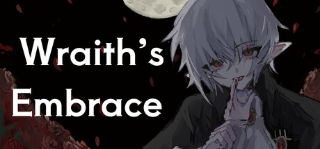
The newly appointed priest Mior, sent to a desolate village, encounters a mysterious boy named Fei deep in the forest. White hair, red eyes. Smiling in solitude, he felt cold to the touch, yet terrifyingly captivating.
$5.993 user reviews
AdventureSimulationVisual Novel
mokosoftFeb 19, 2026