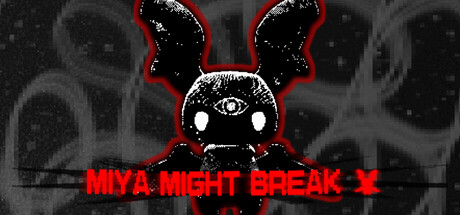
Miya Might Break scores 72/100 — better than 51% of Visual Novel capsules (n=1,147).

Quick text summary

Miya Might Break scored 72/100 on Steam Analyzer — Good for a Visual Novel capsule. Top priority fix: [genre_clarity] Incorporate subtle visual novel interface elements (dialogue window, text box, or choice menu frame) to clarify the narrative game format and differentiate from action horror.

Capsule scores by dimension

  • Genre Clarity: 7/10 — Horror and psychological distress evident. The pixelated bunny character with glowing eyes, red accents, and symmetrical unsettling design clearly signals horror or psychological disturbance rather than lighthearted adventure. At TINY size, the distinctive silhouette and red-black palette still convey 'something is wrong' effectively, though the specific visual novel genre is not immediately apparent without context. The grotesque proportions and staring eyes confirm horror subgenre rather than cozy indie.
  • Title Readability: 8/10 — Bold red text reads clearly at all sizes. MIYA MIGHT BREAK uses bright red, all-caps letterforms with clean sans-serif styling positioned prominently in the center-lower area with a black background support region. Text remains readable at SMALL (231x87) and TINY (120x45) sizes due to high contrast and large letterform weight. The title placement avoids clutter and maintains legibility even under quick scroll conditions.
  • Contrast & Color: 8/10 — Strong red-black separation against dark Steam bg. The bright red title text and red ear accents create sharp value separation against the black background and dark Steam interface (#1b2838), with the white eye highlights providing additional silhouette clarity. Grayscale test shows distinct separation between subject (dark bunny), accent color (red), and void (black), ensuring the design does not collapse when desaturated. High saturation red ensures the eye is drawn even at TINY thumbnail size during quick scrolling.
  • Uniqueness & Polish: 7/10 — Distinctive pixel art style, generic execution. The low-resolution pixel art bunny with unsettling features (oversized eyes, symmetrical ears, fixed stare) creates a memorable and slightly creepy aesthetic that aligns with indie horror expectations. However, the concept of 'creepy mascot character' is a common indie horror trope seen in games like The Binding of Isaac or Doki Doki Literature Club; the execution is solid but not deeply original. The visual communicates the game's disturbing tone effectively without revealing the specific psychological horror or visual novel mechanics that make it distinctive.
  • Brand Consistency: 6/10 — Functional branding, minimal identity signals. The pixel art bunny character (Mopa, the talking plush) and the red-black color scheme appear intentional and consistent with a psychological horror aesthetic. Without access to other marketing materials or in-game screens, the capsule reads as thematically coherent with the horror description, but does not establish a particularly iconic or recognizable brand motif beyond 'creepy mascot.' The stark presentation lacks secondary symbols or signature visual language that would distinguish it from other pixel art horror titles.
  • Composition: 7/10 — Clear focal point with balanced hierarchy. The bunny character occupies the center-upper region as the primary focal point, with the title anchored below in a clean, separated layout that avoids overlap or ambiguity. Background gradient texture provides subtle depth without competing for attention. At SMALL and TINY sizes, the bunny remains the obvious primary subject and the red text title maintains secondary focus, creating a two-tier hierarchy that reads well on quick scroll. Safe margins around edges protect critical elements from Steam cropping.

What works

  • High contrast red title text. Bright red all-caps lettering against black background ensures readability at all viewport sizes, including TINY thumbnails during rapid scrolling.
  • Memorable unsettling character design. The pixelated bunny with glowing eyes and symmetrical features immediately signals psychological horror and creates a distinctive visual hook.
  • Strong genre alignment with presentation. Red-black palette, glowing eyes, and grotesque proportions cohesively communicate 'horror' and 'psychological disturbance' without confusion.

What hurts the capsule

  • No visual novel narrative signals. The capsule does not communicate dialogue, choice systems, or story-heavy gameplay that defines the visual novel genre; it reads as generic horror instead.
  • Limited brand identity beyond mascot. The design relies entirely on the creepy bunny character without establishing secondary branding elements, icons, or signature visual language that could be recognized across other marketing materials.
  • Minimal context for game's unique hook. The capsule does not hint at the 'bystander who hears every step' mechanic, the decaying home setting, or the specific psychological themes that make the game distinctive from other indie horror titles.

Priority fixes

  1. [genre_clarity] Incorporate subtle visual novel interface elements (dialogue window, text box, or choice menu frame) to clarify the narrative game format and differentiate from action horror.
  2. [uniqueness_polish] Add secondary visual branding elements such as a signature symbol, home interior silhouette, or thematic motif (e.g., broken clock, decay detail) that hints at the game's specific setting and mechanics.
  3. [composition] Include minimal supporting imagery (shadowy background figure or home outline) that reinforces the 'bystander' or 'trapped in home' narrative without cluttering the primary bunny focal point.

Store copy priority fixes

  1. [feature_communication] Add a sentence explaining how player choices drive the narrative and lead to the three distinct endings—clarify whether this is linear with choice-at-end, branching dialogue, or belief-tracking mechanics.
  2. [feature_communication] Expand on Mopa's nature and function in gameplay: is Mopa a coping mechanism, a real object with agency, or ambiguous by design? A single clarifying phrase would increase player understanding.
  3. [hook_strength] In the detailed description, add one sentence about what the player's core goal or decision-point is—is survival the goal, escape, understanding truth, or preserving sanity?
  4. [audience_targeting] Insert a phrase like 'slow-burn psychological horror' or 'atmosphere-driven narrative' early in the detailed description to set tone expectations and signal this is introspective rather than action-paced.

Related guides

Steam app ID: 4238360 · Tags: Visual Novel, Psychological Horror, Horror, Anime, Choose Your Own Adventure