Scoring genre clarity...

Dead Bit capsule

Dead Bit

Fast-paced runner-shooter where every run is a risky raid. Blast through enemies, grab loot, upgrade your weapons and gear, and unlock harder raids with new enemies and tactics each time you reach the end.

$4.992 user reviews
ActionCasualArcade
escape2echoMar 2, 2026

Dead Bit scores 70/100 — better than 29% of Action capsules (n=8,535).

2 user reviews · $4.99 · Released Mar 2, 2026 · By escape2echo

Quick text summary

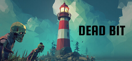
Dead Bit scored 70/100 on Steam Analyzer — Good for a Action capsule. Top priority fix: [uniqueness_polish] Introduce a signature visual trait or distinctive mechanic indicator (weapon style, armor detail, or environmental marker) that visually communicates the raid-loot loop.

Capsule scores by dimension

  • Genre Clarity: 7/10 — Action gameplay implied clearly. The undead protagonist on the left with visible weapon readiness and the post-apocalyptic landscape with sparse trees suggest action-adventure or shooter gameplay. At TINY size, the zombie figure and desolate environment read as combat-focused, though the lighthouse structure creates some visual ambiguity about the setting's thematic purpose. The overall mood communicates danger and survival, aligning with action-casual expectations.
  • Title Readability: 8/10 — Bold sans-serif title reads clearly. DEAD BIT uses a heavy black sans-serif typeface positioned in the right third against a relatively clear sky area, providing strong contrast against the teal background. At SMALL and TINY sizes, the letterforms remain legible with minimal degradation due to the thick weight and clean geometry. The placement avoids busy foreground elements, ensuring readability across all viewing scales.
  • Contrast & Color: 8/10 — Strong teal-to-warm value separation. The cool teal-blue background contrasts effectively with the warm orange-red lighthouse beacon and the greenish-gray zombie figure in the foreground. In grayscale simulation, the mid-tone zombie separates from the lighter sky and darker landscape elements, creating clear silhouettes. The warm beacon acts as a secondary focal highlight that catches attention without overwhelming the primary subject.
  • Uniqueness & Polish: 6/10 — Competent but genre-familiar aesthetic. The undead protagonist, barren landscape, and lighthouse setting are visually competent and atmospheric, but the post-apocalyptic zombie theme is well-established in game marketing. The digital art style is polished and readable, yet lacks a distinctive visual hook or character trait that would set it apart from other action-casualty titles. The execution is solid, but the concept feels within expected boundaries for the genre.
  • Brand Consistency: 6/10 — Coherent but not yet iconic. The capsule presents a consistent color palette (teals, warm accents, desaturated figures) and clear digital art direction that suggests a recognizable visual identity. However, without reference to the five store screenshots, it is difficult to confirm whether the zombie protagonist and lighthouse are signature brand elements or if they serve as memorable identity cues across marketing materials. The rendering style appears consistent and intentional, but brand distinctiveness cannot be fully assessed from this image alone.
  • Composition: 7/10 — Clear hierarchy with minor balance issues. The zombie figure anchors the left-center foreground, the lighthouse dominates the right-center as a secondary landmark, and the title DEAD BIT sits in the upper right. At SMALL and TINY sizes, the zombie reads as the primary focal point while the beacon provides compositional depth. The empty sky area in the upper left feels slightly unbalanced, and the grass line in the foreground could be stronger, but overall the layout maintains clear visual separation and avoids clutter across all viewing scales.

What works

  • Title contrast and placement. Black sans-serif text positioned over clear sky area with zero competition for attention, maintaining full readability at TINY size.
  • Color separation and focal depth. Cool teal background effectively isolates warm lighthouse beacon and zombie foreground figure, creating strong silhouette definition in grayscale.
  • Atmospheric action context. Undead protagonist and desolate post-apocalyptic setting immediately signal combat-focused action gameplay without confusion.

What hurts the capsule

  • Generic zombie theme. The post-apocalyptic undead survivor aesthetic is well-established in games and lacks a distinctive visual or thematic hook that differentiates this title.
  • Lighthouse narrative ambiguity. The prominent lighthouse structure does not clearly connect to the runner-shooter loot-raid gameplay loop, creating thematic disconnection between environment and mechanics.
  • Subtle brand identity signals. Without additional reference materials, the capsule does not present obvious iconic character traits, symbols, or palette elements that would ensure immediate brand recognition.

Priority fixes

  1. [uniqueness_polish] Introduce a signature visual trait or distinctive mechanic indicator (weapon style, armor detail, or environmental marker) that visually communicates the raid-loot loop.
  2. [brand_consistency] Establish and reinforce a memorable protagonist design element (unique silhouette, color accent, or equipment) that anchors brand recognition across all marketing materials.
  3. [composition] Add secondary foreground elements or environmental detail to balance the upper-left void and strengthen the visual weight distribution without creating clutter.

Store copy priority fixes

  1. [uniqueness] Explain what '3 way runner-shooter' means—does it refer to 3 weapon types, 3 route variants, or 3 movement mechanics? Replace the vague term with concrete differentiation.
  2. [feature_communication] Add 1-2 specific upgrade examples in the detailed description, e.g., 'upgrade fire rate, ammo capacity, or melee power' to show tangible progression impact.
  3. [hook_strength] Rewrite 'risky raid' to specify the risk: e.g., 'lose all upgrades on death' or 'race against incoming hazards,' making risk mechanically concrete.

Related guides

Steam app ID: 4240500 · Tags: Action, Casual, Arcade, Shooter, Runner