Scoring genre clarity...

Cosmo Blue - A Space Odor Mystery capsule

Cosmo Blue - A Space Odor Mystery

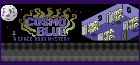
Isometric retro point-and-click adventure that could have launched on the C64 in 1985: tricky puzzles, a delightfully twisted story, and authentic pixels in a modern guise. Head to Space Station E-17 and uncover the mystery of the legendary party artefact.

$1.996 user reviews
AdventureRetroOld School
René RuppertJan 20, 2026

Cosmo Blue - A Space Odor Mystery scores 77/100 — better than 84% of Adventure capsules (n=7,922).

6 user reviews · $1.99 · Released Jan 20, 2026 · By René Ruppert

Quick text summary

Cosmo Blue - A Space Odor Mystery scored 77/100 on Steam Analyzer — Good for a Adventure capsule. Top priority fix: [title_readability] Increase tagline size and apply a semi-transparent dark background box or outline to ensure 'A SPACE ODOR MYSTERY' remains readable at SMALL size without clipping.

Capsule scores by dimension

  • Genre Clarity: 8/10 — Retro adventure with space setting clear. The isometric space station structure on the right, the moon in the top left, and the retro pixel art style immediately signal a classic adventure game set in space. At TINY size, the isometric building silhouette and starfield remain recognizable, though genre shifts from adventure to puzzle or sci-fi comedy remain slightly ambiguous without the tagline text.
  • Title Readability: 7/10 — Title readable at full size only. The 'COSMO BLUE' logo in blue-purple with gold serpentine decorative elements reads well at full header size with good contrast against the dark starfield background. However, at SMALL size the decorative elements begin to muddy the letterforms, and at TINY size the title collapses into an illegible blur—the tagline 'A SPACE ODOR MYSTERY' is completely unreadable at small sizes due to its tiny scale and low contrast against the gray grid.
  • Contrast & Color: 8/10 — Strong value separation supports discovery. The bright white moon pops clearly against the deep purple-black starfield, and the blue-purple title with gold accents creates distinct value separation from the background. The isometric station structure in light tan and gray maintains good contrast at SMALL size, though the gray grid pattern at the bottom risks blending into the Steam dark background at TINY sizes.
  • Uniqueness & Polish: 8/10 — Distinctive retro aesthetic with personality. The deliberate C64-era pixel art style, combined with the absurdist premise 'space odor mystery,' creates a memorable and specific hook that stands apart from typical sci-fi adventures. The gold serpent ornamentation around the title adds craft and visual interest, signaling intentional art direction rather than a generic template; this distinctive tone is evident even at SMALL size.
  • Brand Consistency: 7/10 — Coherent retro palette with strong identity. The purple-blue-gold color scheme, isometric perspective, and pixel art rendering style create a recognizable internal identity that should carry through store screenshots and marketing. The gold serpent motif appears intentionally iconic, though without access to other materials it is difficult to confirm this motif is used consistently as a signature brand element across the game's visual identity.
  • Composition: 8/10 — Balanced layout with clear focal hierarchy. The moon anchors the top left as a secondary focal point, the title occupies strong center-left placement, and the isometric station structure balances the right side, creating depth and visual flow. At SMALL size the composition reads well with the building and moon remaining distinct; the grid pattern at the bottom provides texture but does not clutter the primary message, though it risks becoming muddy at TINY sizes due to tight line spacing.

What works

  • Strong moon and starfield backdrop. The bright white moon and deep purple-black starfield create excellent contrast and immediately establish the sci-fi space setting with visual clarity at all sizes.
  • Distinctive retro-adventure personality. The deliberate pixel art aesthetic combined with the absurdist 'odor mystery' premise creates memorable brand identity that stands out from generic sci-fi adventures.
  • Effective isometric station structure. The tan and gray isometric building on the right provides immediate visual communication of the space station setting and maintains recognizable silhouette even at SMALL size.
  • Gold serpent decorative craft. The ornamental gold serpent elements around the title add intentional polish and visual hierarchy, elevating the design beyond template-like presentation.

What hurts the capsule

  • Tagline unreadable at small sizes. The 'A SPACE ODOR MYSTERY' subtitle is too small and lacks sufficient contrast to remain legible at SMALL or TINY viewing sizes, reducing the uniqueness hook's impact.
  • Bottom grid pattern muddy at small sizes. The tight horizontal grid line texture at the bottom lacks sufficient value separation from the Steam dark background and becomes visually noisy at SMALL size, adding clutter without purpose.
  • Title loses clarity below full size. The decorative serpent elements, while visually appealing at full header size, create visual noise that degrades legibility when the title scales down to SMALL or TINY sizes.

Priority fixes

  1. [title_readability] Increase tagline size and apply a semi-transparent dark background box or outline to ensure 'A SPACE ODOR MYSTERY' remains readable at SMALL size without clipping.
  2. [contrast_color] Reduce or simplify the bottom grid pattern to improve contrast against the Steam dark background, or move it higher to avoid blending into the footer area.
  3. [composition] Ensure the title maintains a minimum pixel size for the decorative elements so serpent details do not obscure letterform clarity when scaled below 200px width.

Store copy priority fixes

  1. [feature_communication] Add estimated playtime (e.g., '4-6 hours') and specify 1–2 example puzzles or mini-games to help players understand scope and difficulty.
  2. [uniqueness] Include a sentence explicitly differentiating this from other retro point-and-clicks, such as 'the only C64-style adventure centered entirely around a smell-based crisis' or highlight a unique mechanic beyond standard exploration.
  3. [feature_communication] Clarify the 'olfactory crisis' setup with one additional sentence in the short description or opening paragraph to make the stakes immediately obvious to unfamiliar players.
  4. [audience_targeting] Add a single phrase targeting hardcore retro fans or casual puzzle players (e.g., 'Perfect for fans of classic LucasArts adventures' or 'ideal for puzzle enthusiasts looking for bite-sized challenges').

Related guides

Steam app ID: 4244430 · Tags: Adventure, Retro, Old School, Isometric, Funny