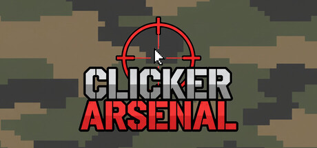
Clicker Arsenal scores 70/100 — better than 30% of Indie capsules (n=11,449).

Quick text summary

Clicker Arsenal scored 70/100 on Steam Analyzer — Good for a Indie capsule. Top priority fix: [uniqueness_polish] Add a small iconic visual element (weapon silhouette, progression indicator, or mascot character) in the corner to create a memorable identity beyond the generic crosshair.

Capsule scores by dimension

  • Genre Clarity: 7/10 — Idle clicker with tactical overlay. The red crosshair reticle and targeting circle immediately signal a shooting or combat-focused mechanic, clearly differentiating this from pure idle clickers. The pixelated military camouflage background reinforces tactical/combat theming. At tiny size, the crosshair remains the dominant visual cue, though the specific idle-clicker subgenre blends slightly with strategy due to the tactical UI prominence.
  • Title Readability: 8/10 — Clear, high contrast text. CLICKER ARSENAL is rendered in bold white letters with thick black outline and red drop shadow, sitting on a semi-transparent dark overlay that isolates it from the noisy camouflage background. The two-line layout maintains excellent legibility at all sizes including tiny thumbnails. Title placement is centered and strategically protected from background texture competition.
  • Contrast & Color: 8/10 — Strong value separation achieved. White title text with black outline creates sharp contrast against the muted olive-green camouflage palette, while the red crosshair and red text accent pop distinctly against the warm neutrals. The grayscale test shows clear silhouette separation; the crosshair and text remain readable even when desaturated. Saturation is controlled and not oversaturated, allowing the reds to truly pop without harshness.
  • Uniqueness & Polish: 6/10 — Competent tactical idle execution. The crosshair with targeting circles is a recognizable gameplay element that communicates the core mechanic (aiming/shooting), but the overall composition relies heavily on standard military camouflage texturing, which is a common asset choice. The design is clean and purposeful without significant polish flourishes; it reads as functional rather than distinctive or premium.
  • Brand Consistency: 6/10 — Minimal but coherent identity. The red crosshair and red text create an internal color motif that could be recognizable across store screenshots, and the military camouflage palette is consistent with tactical idle games. However, there are no unique character, iconic symbol, or signature visual style that distinguish Clicker Arsenal's identity from other tactical simulators in the genre.
  • Composition: 7/10 — Centered hierarchy with good focal point. The red crosshair is a clear primary subject centered in the upper third, with the title firmly anchored below it, creating a stable vertical hierarchy. The camouflage background provides context without competing for attention. At tiny size, the crosshair and title remain the unmistakable focal point, though the overall composition is straightforward rather than layered with depth.

What works

  • Readable title at all sizes. White bold text with black outline and strategic dark overlay ensures CLICKER ARSENAL remains legible even at tiny thumbnail size without collapse.
  • Clear mechanical cue. The red crosshair immediately communicates a targeting or shooting mechanic, grounding the idle-clicker genre in combat-specific context.
  • Controlled background texture. Camouflage pattern is muted and warm-toned, providing thematic context without creating visual noise that would obscure the title or crosshair.

What hurts the capsule

  • Generic asset-heavy feel. Reliance on standard military camouflage texture makes the capsule feel template-like and similar to many tactical/military games rather than distinctive.
  • Limited visual storytelling. The crosshair alone communicates the mechanic, but there is no visual hint at the core selling point (idle progression, prestige tree, boss encounters) that would make it memorable.
  • No character or iconic presence. Compared to top-performing peers like Balatro or DAVE THE DIVER, this capsule lacks a memorable character, mascot, or signature art direction that creates instant brand recall.

Priority fixes

  1. [uniqueness_polish] Add a small iconic visual element (weapon silhouette, progression indicator, or mascot character) in the corner to create a memorable identity beyond the generic crosshair.
  2. [genre_clarity] Incorporate a subtle progression or upgrade visual cue (stacked weapons, evolving arsenal hint) to communicate the core idle-progression loop more effectively at tiny size.
  3. [contrast_color] Test the red crosshair against the #1b2838 Steam background specifically; consider a slightly brighter or more saturated red if it reads too close to the dark greens.

Store copy priority fixes

  1. [tone_match] Soften or remove 'art of war' and 'annihilating solar systems' language, or explicitly frame the game as a relaxing clicker with optional tactical engagement to align tone with the Relaxing tag and avoid misdirecting players expecting zen gameplay.
  2. [audience_targeting] Add a sentence early in the detailed description addressing the core audience, e.g., 'Perfect for players who enjoy idle progression with moments of active tactical control' or 'Built for both casual clickers and strategy fans.'
  3. [uniqueness] Strengthen the Prestige system description by adding a specific example of a skill choice (e.g., 'Choose between Swift Finger to maximize clicking power or Optimized Systems to earn ammo passively while offline') to clarify how the upgrade tree is meaningful.
  4. [hook_strength] Replace the closing question with a more specific call-to-action tied to the core gameplay loop, e.g., 'Start with a slingshot. End as a cosmic force. The ascension awaits.' to reinforce the progression fantasy.

Related guides

Steam app ID: 4248250 · Tags: Indie, Casual, Simulation, Relaxing, 2D