Bouncy Brain scores 75/100 — better than 65% of Casual capsules (n=10,153).

Quick text summary

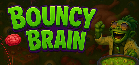
Bouncy Brain scored 75/100 on Steam Analyzer — Good for a Casual capsule. Top priority fix: [uniqueness_polish] Introduce a visual element that hints at the core loop—such as a floating ingredient, soup bowl, or bouncing brain with a trail effect—to communicate the unique gameplay hook.

Capsule scores by dimension

  • Genre Clarity: 7/10 — Casual physics puzzle evident. The bright lime-green title and bouncing ball visual immediately signal a casual, physics-based game. The cartoonish undead character and colorful aesthetic reinforce a lighthearted, non-violent gameplay experience. At TINY size, the ball and character silhouettes remain readable, though the specific 'cooking soup' mechanic is not visually apparent from the capsule alone.
  • Title Readability: 9/10 — Excellent bold legibility. The bright lime-green sans-serif 'BOUNCY BRAIN' typography has exceptional contrast against the dark background and maintains perfect readability at FULL, SMALL, and TINY sizes. The thick letterforms and generous spacing ensure no collapse or blur loss, and the shadow outline adds depth without sacrificing clarity. No tagline clutter distracts from the primary title.
  • Contrast & Color: 8/10 — Strong value separation. The neon lime-green title pops dramatically against the dark forest-brown background, creating high luminance contrast that survives the squint test and grayscale conversion. The character and ball also benefit from warm yellow and red accents that separate cleanly from cooler midtones. At TINY size, the overall silhouette remains distinct, though some fine character detail softens.
  • Uniqueness & Polish: 7/10 — Charming character with polish. The grinning undead character in yellow coat has personality and a clear visual hook that suggests quirky humor and charm. The overall composition feels intentional and crafted, with cohesive color choices and a playful art direction that differentiates it from generic puzzle games. However, the scene remains relatively straightforward without a standout mechanical or visual twist that screams 'this is Bouncy Brain specifically'.
  • Brand Consistency: 6/10 — Functional identity, limited recall. The undead character, lime-green palette, and playful tone are internally cohesive and would likely be recognized in store screenshots if consistent. The visual identity is competent and matches the casual, chill gameplay promise. However, there are no iconic motifs, signature symbols, or distinctive rendering techniques that would make the brand instantly memorable or stand apart from other whimsical indie titles.
  • Composition: 8/10 — Clear hierarchy, balanced layout. The title anchors the top-left and center area with strong visual weight, while the character occupies the right-center foreground, creating natural depth and eye flow. The background foliage is textured but not overwhelming, and key elements avoid harsh edge cropping. At SMALL and TINY sizes, the focal point (title + character) remains clear, and supporting elements guide attention without competing.

What works

  • Title contrast and legibility. Lime-green bold sans-serif reads perfectly at all sizes, including TINY, with no risk of collapse or blur loss.
  • Character personality and warmth. The grinning undead character in yellow coat adds instant charm and humor that communicates the relaxed, lighthearted tone.
  • Clean hierarchy and composition. Title and character have clear primary/secondary roles that create natural eye flow and avoid scattered attention.
  • Effective color pop. Neon lime-green and warm yellow separate cleanly from the dark background and survive squint and grayscale tests.

What hurts the capsule

  • Limited brand distinctiveness. The visual identity, while competent and charming, lacks iconic or signature elements that would ensure instant recognition versus other quirky indie titles.
  • Gameplay mechanic opacity. The cooking soup, ingredient gathering, and physics-drop core loops are not visually communicated; only the 'bouncy' and 'character' aspects are obvious.
  • Generic casual category fit. The capsule does not strongly differentiate itself from other physics puzzle or casual game benchmarks like Balatro or Sticky Business in terms of visual hook.

Priority fixes

  1. [uniqueness_polish] Introduce a visual element that hints at the core loop—such as a floating ingredient, soup bowl, or bouncing brain with a trail effect—to communicate the unique gameplay hook.
  2. [brand_consistency] Develop a signature visual motif or icon (e.g., a brain shape, ingredient symbol, or UI element) that appears consistently across all store assets to strengthen recall.
  3. [genre_clarity] Add a subtle visual cue such as an ingredient particle, light sparkle, or cooking UI element to hint at the 'interactive' and 'cooking' mechanics beyond the basic ball-drop.

Store copy priority fixes

  1. [hook_strength] Rewrite the short description to lead with an emotional or curiosity hook—e.g., 'Guide a chaotic bouncing brain through zombie-infested labs, watch it hilariously ricochet through physics puzzles, and cook absurd soups without lifting a finger' to create intrigue before explaining mechanics.
  2. [uniqueness] Add a specific differentiator that explains why this game stands apart from other physics-based or idle games—e.g., mention a unique mechanic, art style, or design philosophy that only this game offers.
  3. [audience_targeting] Replace the generic 'perfect for players who enjoy...' sentence with a more specific audience signal—e.g., 'Made for players who want a game that plays itself while you work, chat, or watch videos—guilt-free gaming.'
  4. [feature_communication] Add clarification on progression scope and replayability—e.g., mention the total number of recipes/soups, estimated playtime to unlock all content, or what keeps players engaged beyond initial completion.

Related guides

Steam app ID: 4248660 · Tags: Casual, Arcade, Idler, Physics, Relaxing