Scoring genre clarity...

Memory Maze capsule

Memory Maze

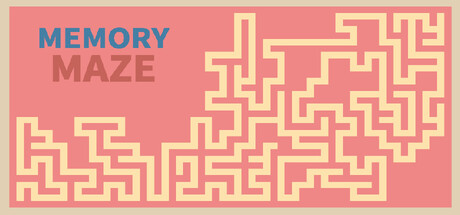
Memory Maze is a puzzle game focused on pure exploration. Navigate procedurally generated mazes with a limited view, relying entirely on your memory and spatial sense. Without timers or scores, progress at your own calm pace through ever-changing labyrinths.

$1.993 user reviews
CasualStrategyPuzzle
ChrisYUApr 5, 2026

Memory Maze scores 68/100 — better than 18% of Casual capsules (n=10,153).

3 user reviews · $1.99 · Released Apr 5, 2026 · By ChrisYU

Quick text summary

Memory Maze scored 68/100 on Steam Analyzer — Solid for a Casual capsule. Top priority fix: [genre_clarity] Add a subtle visual metaphor for memory—such as a faded or partially revealed maze path, or a small character/eye icon—to communicate the unique memory mechanic and differentiate from generic maze puzzles at tiny size.

Capsule scores by dimension

  • Genre Clarity: 7/10 — Puzzle maze clearly communicated. The yellow maze pattern filling the right side of the capsule immediately signals a puzzle game focused on navigation and spatial reasoning. The minimalist, geometric aesthetic aligns well with casual puzzle expectations. However, at tiny size the maze becomes abstract geometric noise, losing the specific 'memory puzzle' hook and reading more generically as a maze game without the memory mechanic being visually apparent.
  • Title Readability: 8/10 — Title clear at all sizes. The two-line 'MEMORY' and 'MAZE' layout uses strong color separation—blue for 'MEMORY' and muted mauve for 'MAZE'—with solid letterforms that remain readable at small and tiny sizes. The spacing is clean and the text sits on a controlled coral background region away from the maze pattern noise. At tiny size the stacking remains legible, though the blue-mauve contrast weakens slightly but stays functional.
  • Contrast & Color: 7/10 — Warm palette pops adequately. The warm coral-pink background and pale yellow maze create moderate value separation against the Steam dark background #1b2838. The color scheme is inviting and cohesive, but the yellow-on-pink contrast is primarily saturated rather than luminance-based, which softens perceived depth at tiny size. The blue 'MEMORY' text does pop well, though the overall palette leans toward mid-tone warmth that could feel slightly muddy in grayscale.
  • Uniqueness & Polish: 6/10 — Competent but visually generic. The clean geometric maze pattern and warm color palette show intentional design, but the execution feels like a straightforward maze visualization rather than a distinctive art direction or unique visual hook. The capsule communicates the core mechanic clearly but lacks a memorable stylistic signature, character, or visual storytelling element that would elevate it above a competent baseline template approach.
  • Brand Consistency: 6/10 — Minimal identity markers present. The palette and maze motif appear consistent with the game's core concept, but without reference to store screenshots there are no distinctive brand identity signals—no iconic character, logo, or signature visual element that would be recognizable across multiple touchpoints. The geometric maze style could work as a consistent motif if maintained across all marketing materials, but this capsule alone does not establish strong memorability.
  • Composition: 7/10 — Balanced hierarchy with clear focal zones. The title occupies the left third with strong visual weight, while the maze pattern anchors the right side with clear spatial balance and no dead center voids. The layout creates good depth layering with title, colored background, and maze pattern. At small and tiny sizes the composition remains readable with the title clearly separated from the visual pattern, though the maze detail becomes abstracted and the layout feels slightly front-loaded toward text.

What works

  • Clean title separation and contrast. Two-line layout with blue and mauve coloring ensures 'MEMORY MAZE' remains legible at tiny size and sits safely on the coral background away from maze noise.
  • Genre mechanic immediately visible. The geometric yellow maze pattern on the right instantly communicates puzzle-solving and spatial navigation as the core gameplay focus.
  • Warm inviting color palette. The coral-pink and pale yellow scheme creates a friendly, approachable aesthetic that suits casual puzzle positioning and stands out against Steam's dark interface.

What hurts the capsule

  • Memory mechanic not visually reinforced. The capsule shows a maze but does not visually communicate the 'memory' element—there is no UI hint, limited view indicator, or visual metaphor that explains why memory is the core mechanic.
  • Abstract maze pattern loses detail at tiny size. At thumbnail scale the intricate yellow maze becomes visual noise rather than a clear focal point, reducing impact during quick Steam browsing.
  • Generic visual execution lacking distinctiveness. The design is competent but shows no signature art style, character, or memorable visual hook that would differentiate it from other maze or puzzle game capsules in the genre.

Priority fixes

  1. [genre_clarity] Add a subtle visual metaphor for memory—such as a faded or partially revealed maze path, or a small character/eye icon—to communicate the unique memory mechanic and differentiate from generic maze puzzles at tiny size.
  2. [uniqueness_polish] Introduce a distinctive art direction element such as a stylized character, iconic symbol, or signature texture that creates memorability and elevates the capsule above a template-like appearance.
  3. [contrast_color] Increase value contrast by introducing a darker accent or lighter highlight to create stronger silhouette separation between the maze pattern and background, improving readability at small and tiny sizes.

Store copy priority fixes

  1. [hook_strength] Rewrite the short description's opening to lead with a specific spatial or memory challenge: e.g., 'Navigate procedurally generated mazes with only a small window of sight—your memory is your map.' This adds urgency and clarity over the current 'pure exploration' framing.
  2. [uniqueness] Add one sentence to the detailed description that articulates a concrete differentiator, such as 'Unlike traditional maze games, our procedural algorithms create mazes that mirror real architectural and garden design patterns, making each puzzle feel organically distinct.'
  3. [audience_targeting] Include a brief line about session length or progression scope to help players gauge time commitment and whether the experience is infinite, goal-based, or episodic.

Related guides

Steam app ID: 4249980 · Tags: Casual, Strategy, Puzzle, Dungeon Crawler, 2D