Scoring genre clarity...
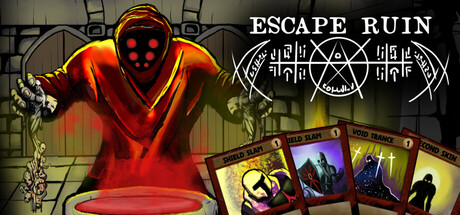
Death brings you to the Ruin: a shifting limbo ruled by hungry Gods. Build your deck, battle their followers, and decide whether to remain pure or wield corrupted power. Carve your path through the darkness and escape—if you can.
$10.992 user reviews
DeckbuildingRoguelike DeckbuilderCard Game
To The Core GamesFeb 4, 2026