Quick text summary
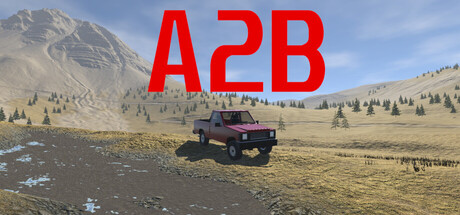
A2B scored 62/100 on Steam Analyzer — Solid for a Simulation capsule. Top priority fix: [uniqueness_polish] Recompose the capsule with a custom art style or distinctive visual treatment—consider stylized terrain deformation effects, a dynamic vehicle pose (mid-drift or jumping), or environmental cues that communicate the 'no waypoints, find your own path' mechanic.
Capsule scores by dimension
- Genre Clarity: 7/10 — Off-road racing evident but generic. The landscape setting, vehicle placement, and open terrain clearly signal a driving or racing game. At TINY size, the vehicle and mountain backdrop are recognizable, but the specific off-road time-trial mechanic with terrain deformation is not visually communicated—it reads as generic open-world driving rather than a distinctive racing mode.
- Title Readability: 9/10 — Bold red title dominates clearly. The large red 'A2B' text sits prominently against the light sky background with excellent contrast and bold letterforms that remain highly legible even at TINY size. The simple three-character format resists collapse and reads instantly during quick scroll.
- Contrast & Color: 6/10 — Adequate contrast but soft separation. The red title pops well against the sky, but the vehicle and terrain blend into a warm, muted palette with limited value separation in the landscape itself. Against the dark Steam background #1b2838, the overall image lacks the silhouette punch and edge definition needed to stand out at SMALL and TINY sizes—the vehicle reads as a soft shape rather than a crisp focal point.
- Uniqueness & Polish: 5/10 — Generic open-world driving aesthetic. The capsule presents a stock game engine screenshot with a parked vehicle in a procedural terrain landscape—no distinctive visual hook, custom artwork, or unique mechanical implication visible. Compared to top-performing racing and simulation capsules, this lacks intentional art direction, character, or a clear visual story that communicates the core mechanic of terrain deformation and route freedom.
- Brand Consistency: 4/10 — No recognizable brand identity cues. The capsule shows no icon, character, recurring motif, or signature palette that would create brand recognition across future marketing. The generic landscape, standard vehicle model, and plain red text offer no memorable identity signals—it could represent any indie driving game without context.
- Composition: 6/10 — Centered vehicle lacks focal depth. The vehicle sits in the center of the frame with mountains in the far background and generic terrain filling the midground, creating a flat hierarchy with no clear primary subject emphasis. At TINY size, the vehicle shrinks to a negligible detail, and the composition reads as a generic landscape with a small object, wasting the opportunity to guide focus through layering or foreground interest.
What works
- Title legibility at all sizes. The large, bold red 'A2B' text remains instantly readable from FULL size down to TINY thumbnails due to strong contrast, simple letterforms, and strategic placement on the lighter sky region.
- Clear game context. The vehicle and open landscape immediately communicate this is a driving or racing title, setting the correct genre expectation at a glance.
What hurts the capsule
- Generic asset-store appearance. The capsule looks like an engine default screenshot with a parked vehicle on procedural terrain, lacking custom artwork, intentional design, or polished craft that signals premium indie production.
- No visual mechanic communication. The image does not hint at the unique selling point—terrain deformation, route freedom, or time-trial racing—and reads as generic open-world driving instead.
- Weak focal point at scale reduction. The vehicle shrinks into irrelevance at SMALL and TINY sizes, leaving the composition as a bland landscape with scattered elements rather than a memorable hero shot.
- Soft silhouette and muddy midtones. The vehicle and terrain lack crisp edge definition and distinct value separation, blending into warm, muted tones that do not pop against the dark Steam background in scrolling context.
Priority fixes
- [uniqueness_polish] Recompose the capsule with a custom art style or distinctive visual treatment—consider stylized terrain deformation effects, a dynamic vehicle pose (mid-drift or jumping), or environmental cues that communicate the 'no waypoints, find your own path' mechanic.
- [contrast_color] Increase silhouette separation by introducing darker foreground terrain or a higher contrast vehicle design; test grayscale readability to ensure the vehicle and landscape do not merge at TINY size.
- [composition] Reposition the vehicle as an off-center focal point with supporting terrain depth layering; create foreground interest to maintain visual hierarchy and impact when scaled down.
- [brand_consistency] Develop a signature visual identity—consider an iconic vehicle livery, a consistent color palette, or a distinctive UI element (e.g., directional arrow or terrain grid) that can carry across future marketing materials.
Store copy priority fixes
- [feature_communication] Expand on deformable terrain and how it impacts route-finding: explain whether mud, rocks, or slopes deform dynamically and force strategic path-planning choices.
- [hook_strength] Rewrite the closing tagline to lead with the exploration and problem-solving aspect, e.g., 'Plot your own line. Outsmart the terrain.' to emotionally resonate with route-freedom players.
- [audience_targeting] Add one sentence clarifying the intended audience, e.g., 'Designed for rally enthusiasts and open-ended racing fans who value exploration over prescribed tracks' or 'Perfect for players who love rally sims but crave creative freedom.'
- [feature_communication] Include Early Access context: state what content is current, what is planned, and expected timeframe to full release or final feature set.
Related guides
Steam app ID: 4252060 · Tags: Simulation, Racing, Automobile Sim, Exploration, Immersive Sim