Scoring genre clarity...
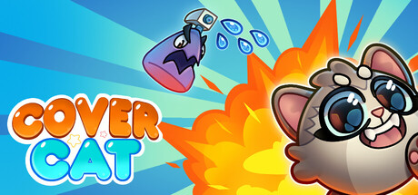
In the physics-based puzzle Cover Cat, you save a kitten from a mischievous water-spraying bottle by hiding it behind various objects. Conceal your fluffy friend behind boxes, platforms, and yarn balls to keep it dry. Use the laws of physics to choose the best hiding spots and protect the cat.
$1.99
CasualAdventureArcade
ITKING.PROJan 17, 2026