The Bard's Kingdom scores 62/100 — better than 3% of Action capsules (n=8,534).

Quick text summary

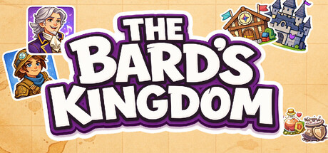
The Bard's Kingdom scored 62/100 on Steam Analyzer — Solid for a Action capsule. Top priority fix: [genre_clarity] Integrate subtle rhythm game iconography—add a faint musical staff, glowing orbs representing the 6 lanes, or a healing glow around the castle to communicate the healing rhythm core mechanic.

Capsule scores by dimension

  • Genre Clarity: 5/10 — Mixed signals, fantasy unclear. The capsule shows fantasy character portraits and a castle, suggesting a fantasy/adventure game, but the rhythm game core is completely invisible at all sizes. At TINY size, you see colorful character icons and a building but nothing that communicates music, rhythm, or healing as gameplay mechanics. The visual language contradicts the actual genre—this reads as a traditional fantasy RPG, not a rhythm experience.
  • Title Readability: 8/10 — Bold, clear, readable throughout. THE BARD'S KINGDOM is rendered in thick white lettering with strong purple outline and shadow, positioned prominently in the center on a clean tan background. The title remains fully legible at SMALL and TINY sizes due to heavy weight and high contrast against the background. Supporting text and decorative elements do not clutter the primary message.
  • Contrast & Color: 7/10 — Good pop, warm palette readable. The purple outline around white title text creates strong separation against the warm tan/beige background and Steam's dark interface. Character portraits use vibrant colors (blonde hair, bright clothing) that maintain visibility at small sizes. In grayscale, the value separation between title and background remains clear, though the character silhouettes in the corner icons lose some definition due to similar mid-tone ranges.
  • Uniqueness & Polish: 5/10 — Competent fantasy art, generic execution. The capsule uses clean, colorful character artwork and storybook aesthetic consistent with indie fantasy games, but the overall presentation feels like a standard fantasy template with no distinctive hook or premium polish. The portraits and castle tile are well-rendered but do not communicate the unique selling point—a rhythm healing experience—so the visual identity does not differentiate from dozens of other fantasy indie games. No signature visual language or memorable motif emerges beyond cute characters.
  • Brand Consistency: 6/10 — Cohesive art style, identity unclear. The character art, castle icon, and color palette (purples, warm tones, bright character hues) maintain internal consistency suggesting a unified storybook fantasy world. However, without access to compare against the 5 available store screenshots, the broader brand identity cannot be fully assessed. The capsule alone does not establish iconic character recognition, signature palette, or memorable brand signals that would survive future marketing.
  • Composition: 6/10 — Centered title, scattered supporting elements. The title anchors the center with good visual weight, but character portrait tiles and the castle icon are scattered across the upper corners and right edge without clear hierarchy, creating a busy scattered feel. At SMALL and TINY sizes, the corner elements compete for attention rather than guide the eye—the composition lacks a clear primary focal point beyond the title itself. Safe margins are respected, but the layout feels assembled rather than intentionally composed.

What works

  • Strong title legibility. Thick white text with purple outline remains readable at all sizes due to weight, spacing, and high contrast against the tan background.
  • Vibrant, appealing character art. The portraits use bright, saturated colors and detailed fantasy character designs that look polished and hand-crafted rather than generic.
  • Warm, inviting color palette. The beige background and purple/gold accents create a welcoming storybook aesthetic that aligns with a fantasy theme.

What hurts the capsule

  • Genre mismatch visual language. The capsule communicates traditional fantasy RPG while the actual game is a rhythm healing experience—no musical or gameplay-specific iconography is present.
  • Scattered, unfocused composition. Character icons and castle tile scattered across edges and corners create visual noise and competing focal points rather than a unified composition.
  • Generic fantasy template feel. While well-executed, the capsule does not establish a distinctive brand identity, signature motif, or unique visual hook that sets it apart from other fantasy indie games.
  • Rhythm game core completely hidden. No rhythm lane UI hints, musical symbols, or healing/mystical resource visuals present—the core mechanic is entirely absent from visual communication.

Priority fixes

  1. [genre_clarity] Integrate subtle rhythm game iconography—add a faint musical staff, glowing orbs representing the 6 lanes, or a healing glow around the castle to communicate the healing rhythm core mechanic.
  2. [composition] Reposition character portraits and castle icon into a deliberate focal hierarchy rather than scattered corners—consider a unified scene composition with the title overlaid cleanly.
  3. [uniqueness_polish] Add a signature visual element unique to The Bard's Kingdom such as a distinctive musical motif, unique character silhouette, or iconic resource visual that distinguishes it from generic fantasy games.
  4. [contrast_color] Increase character silhouette definition at TINY size by adding darker outline separation or repositioning characters against lighter background regions to maintain readability at small scales.

Store copy priority fixes

  1. [uniqueness] Add a sentence after the short description that articulates the specific combination or twist that makes this rhythm game different (e.g., 'Unlike traditional rhythm games, your musical performance directly shapes the kingdom's recovery' or identify a unique mechanic that competitors lack).
  2. [hook_strength] Rewrite the opening of the detailed description to lead with an emotional or mechanical hook rather than generic fantasy lore: 'Master a 6-lane rhythm game to restore a fallen kingdom's music' or similar verb-forward framing.
  3. [feature_communication] Clarify the resource economy by adding one sentence explaining how Echo, Verse, and Harmony interplay strategically: which resource gates which upgrades, and why the player should care about the tradeoff.
  4. [tone_match] Maintain narrative tone throughout by replacing mechanical description bullets with more lyrical phrasing: change 'Performance meter — Keep your performance up or face an early end' to something like 'Your performance's rhythm is the lifeblood of Cadenza's restoration.'

Related guides

Steam app ID: 4253920 · Tags: Action, Rhythm, 2D, Cute, Controller