Scoring genre clarity...
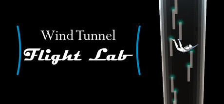
Wind Tunnel Flight Lab is an interactive physics sandbox where you experiment with real aerodynamics in a vertical wind tunnel. Adjust air, gravity, mass, and size to make objects—and a fully controllable human—rise, fall, and fly. Learn, experiment, and play.
$2.99
SimulationFlightSports
Amelia W.Jan 27, 2026