Scoring genre clarity...
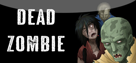
Dead Zombie is a top-down survival shooter set in a dark city at night. Fight zombies and mutated monsters using a pistol, SMG, and flamethrower, explore the environment with a flashlight, rescue survivors, collect ammo, destroy obstacles with bombs, and escape by reaching the evacuation helicopter.
$2.991 user reviews
ActionStrategy2D Fighter
reza alidadFeb 10, 2026