Scoring genre clarity...

Paper Craft capsule

Paper Craft

A VR platformer that takes place in a world of arts and crafts! Run, swing, ride, hover, and platform your way through 20 campaign levels. Create and share your own levels worldwide with our easy to use level editor!

$19.991 user reviews
AdventureVRAction
Solar Eye LLCFeb 26, 2026

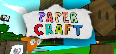
Paper Craft scores 67/100 — better than 17% of Adventure capsules (n=7,922).

1 user reviews · $19.99 · Released Feb 26, 2026 · By Solar Eye LLC

Quick text summary

Paper Craft scored 67/100 on Steam Analyzer — Solid for a Adventure capsule. Top priority fix: [composition] Establish a single primary focal point (e.g., the orange cube character in dynamic pose or mid-jump) and layer supporting craft elements in soft background/midground to create clear depth and eye guidance at tiny size.

Capsule scores by dimension

  • Genre Clarity: 7/10 — Playful craft theme readable. The colorful paper craft visual language and whimsical handmade aesthetic clearly signal a creative, lighthearted game rather than dark action. The presence of craft materials, bright colors, and toy-like proportions immediately differentiate it from the grim action-adventure benchmarks. However, at tiny size the VR platformer core mechanic is not visually apparent—the capsule reads more as a creative/crafting game than a movement-focused platformer.
  • Title Readability: 8/10 — Bold multicolor type holds up. The PAPER CRAFT title uses large, distinct multicolor letterforms (purple, red, cyan, blue) arranged in a clean two-line stack on a white banner background. At full and small sizes this reads perfectly with excellent contrast against the white. At tiny size the letters remain distinguishable and the colors create enough separation to parse, though fine serifs soften slightly.
  • Contrast & Color: 7/10 — Bright palette pops clearly. Vibrant cyan sky, lime green, orange, and brown craft elements contrast strongly against the Steam dark background #1b2838. The white banner holding the title sits high-value and readable. In grayscale, the mid-tone craft materials and sky blend slightly, but the title and primary foreground shapes maintain clear silhouette separation, supporting discoverability at small scroll speed.
  • Uniqueness & Polish: 6/10 — Competent craft aesthetic, generic execution. The paper craft theme is thematically aligned with the game's premise and immediately conveys the art-and-crafts world concept. However, the capsule feels like a straightforward asset showcase rather than a curated visual statement—the composition shows layered craft objects without a focused narrative or distinctive hook that would elevate it above a competent match-the-theme approach. Compared to top-tier indie capsules like Viewfinder or Harold Halibut, this reads more as functional theme illustration than premium visual storytelling.
  • Brand Consistency: 6/10 — Clear theme alignment, no icon signature. The handmade paper craft palette and playful object arrangement reinforce the game's core concept consistently. The orange cube character (visible mid-composition) appears to be a recurring motif. However, without a distinctive logo mark, consistent typography system, or iconic symbol beyond the colorful title treatment, the brand identity remains thematically coherent but not memorably distinct or recognizable outside of context.
  • Composition: 6/10 — Balanced but scattered focal points. The title anchors the composition in the upper center on a strong white band, but the craft objects (cube, paper, craft tools, sky elements) are distributed across the frame without a clear hierarchical read. At tiny size, the title holds attention, but the supporting craft elements compete equally rather than creating depth layers that guide the eye. The composition feels like a themed collage rather than a focused hero moment, though margins appear safe from crop.

What works

  • Title contrast and readability. Multicolor bold letterforms on white banner are legible at all sizes including tiny, with strong color separation supporting quick parsing.
  • Thematic alignment. The paper craft aesthetic immediately communicates the game's core premise and art-and-crafts world, making the theme instantly recognizable.
  • Vibrant color palette. Bright cyan, lime, orange, and brown elements pop clearly against the Steam dark background with strong value contrast.

What hurts the capsule

  • Scattered composition without focal hierarchy. Craft objects are distributed across the frame with equal visual weight, creating a collage feel rather than a clear primary subject that draws attention at small/tiny sizes.
  • Generic visual storytelling. The capsule shows thematic assets arranged together but does not communicate a distinctive selling point, core mechanic, or narrative hook beyond 'this is a crafts-themed game.'
  • No memorable brand signature. While thematically coherent, the design lacks an iconic character, motif, or visual signature that would be recognizable on repeat viewing or marketing.
  • Platformer mechanic not visually implied. The capsule does not communicate the action, movement, or platforming core of the gameplay—a potential clarity gap for discoverability among action-adventure browsers.

Priority fixes

  1. [composition] Establish a single primary focal point (e.g., the orange cube character in dynamic pose or mid-jump) and layer supporting craft elements in soft background/midground to create clear depth and eye guidance at tiny size.
  2. [genre_clarity] Add a subtle hint of platforming momentum or verticality—either through character pose, motion lines, or by placing the cube in a climbing or jumping moment—to signal the action-platformer core alongside the craft theme.
  3. [uniqueness_polish] Develop a distinctive visual hook or character moment (e.g., the cube swinging from paper vine, riding a craft-material vehicle) that communicates the unique selling point and elevates beyond a generic theme illustration.

Store copy priority fixes

  1. [feature_communication] Add 1–2 concrete examples of powerup effects (e.g., 'the Hover powerup lets you glide across gaps' or 'the Speed powerup transforms platforming into time trials') to make the mechanic system tangible.
  2. [uniqueness] Add a sentence explaining how the arts-and-crafts aesthetic shapes gameplay or world interaction (e.g., 'climb through paper towers,' 'navigate origami obstacles') to justify why this setting matters beyond aesthetics.
  3. [audience_targeting] Insert a clear signal for the intended audience: specify whether the campaign appeals to speedrunners, casual explorers, creative level designers, or a mix, so the right player feels immediately welcome.
  4. [feature_communication] Replace 'each world has a unique theme and new mechanics' with one or two concrete example mechanics tied to worlds (e.g., 'World 1 teaches swinging; World 3 introduces magnetic platforms') to help players visualize progression.

Related guides

Steam app ID: 4257240 · Tags: Adventure, VR, Action, 3D Platformer, Platformer