Scoring genre clarity...
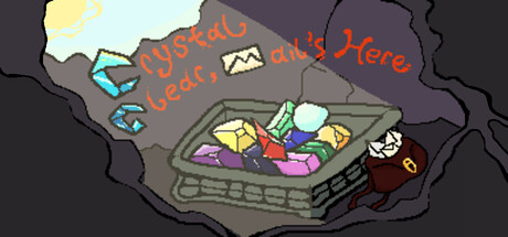
Oh no they're flying away! Crystal Clear, Mail's Here is a cute match three game where you collect Ruby's lost mail. Deliver the letters she finds to unleash massive combos obtaining the highest score.
$4.99
CasualStrategyCard Game
Jake Shonts, Gale Falikson, Anselm Nick BermanFeb 14, 2026