Scoring genre clarity...
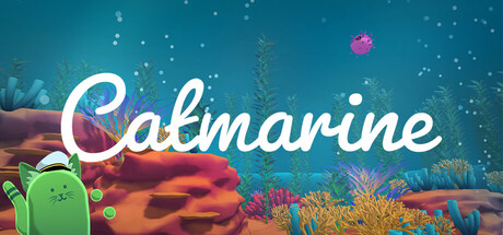
Catmarine is a 2-4 player co-operative, chaotic, typing game. Type to navigate through an ocean world with your cat submarine, the Catmarine! Use the various terminals inside of the Catmarine to maneuver it and to defend against oceanic dangers. Communicate, collaborate, and type as fast as you can!
$5.991 user reviews
ArcadeSide ScrollerTyping
Hex FoundryMay 1, 2026