Scoring genre clarity...
Scoring genre clarity...
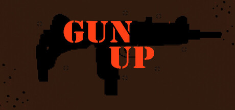
Gun Up scores 73/100 — better than 57% of Action capsules (n=9,073).
1 user reviews · $3.99 · Released Jan 9, 2026 · By Horsepower Interactive
Gun Up scored 73/100 on Steam Analyzer — Good for a Action capsule. Top priority fix: [genre_clarity] Add zombie or undead visual cue (e.g., silhouette of infected enemy, blood splatter, or undead hand) to communicate the survival horror element and differentiate from generic shooters.
Steam app ID: 4258480 · Tags: Action, Bullet Hell, Top-Down Shooter, Shooter, Top-Down