Quick text summary
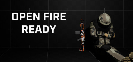
Open Fire: Ready scored 63/100 on Steam Analyzer — Solid for a FPS capsule. Top priority fix: [uniqueness_polish] Introduce a distinctive character design element—custom armor color, faction badge, or signature weapon skin—that creates visual memory and differentiates from generic FPS templates.
Capsule scores by dimension
- Genre Clarity: 7/10 — FPS identity clear but generic. The soldier character in tactical gear with visible weapon and grid-line HUD overlay immediately signals first-person shooter gameplay. At TINY size, the silhouette and weapon remain recognizable, though the character pose is fairly static and doesn't convey dynamic action as strongly as top-performing genre capsules like Lethal Company.
- Title Readability: 8/10 — Bold sans-serif legible at all sizes. White all-caps sans-serif text 'OPEN FIRE READY' sits cleanly on dark background with excellent contrast and spacing. Text remains readable at SMALL and TINY sizes due to thick letterforms and strategic left-side placement away from character detail, avoiding overlap or visual noise.
- Contrast & Color: 7/10 — Strong title-to-background separation. White text pops clearly against the dark grid background with high value separation. The soldier character and equipment read as mid-tone silhouettes that separate from the near-black background, though the overall palette is desaturated and cool-toned, limiting vibrancy and warmth compared to higher-impact indie capsules.
- Uniqueness & Polish: 5/10 — Competent but generic FPS setup. The soldier pose and grid interface are functional genre standards but lack a distinctive visual hook or memorable art style that would differentiate this from dozens of other tactical shooters. The rendering quality is clean but the composition and character presentation feel like a template approach rather than a unique selling point.
- Brand Consistency: 5/10 — No iconic identity markers visible. The capsule shows a generic tactical soldier without a memorable character design, signature color palette, or visual motif that would become recognizable across multiple capsules. The grid-line HUD is a functional gameplay reference but lacks personality or brand-specific styling that would reinforce identity.
- Composition: 6/10 — Balanced but static focal arrangement. Title anchors the left third, character occupies right side with clear separation, creating reasonable balance and safe margins. However, the character is relatively small and positioned passively rather than dynamically, and the grid background fills dead space without adding visual interest or depth layering that would guide the eye at TINY size.
What works
- High-contrast readable title. White sans-serif text maintains legibility at all viewing sizes, including TINY, with no weight loss or collapse.
- Clear genre signaling. Armed soldier silhouette and HUD grid immediately communicate FPS gameplay without ambiguity.
- Clean layout with safe margins. Text and character placement avoid edge clipping and maintain visible breathing room across all display sizes.
What hurts the capsule
- Generic tactical soldier archetype. Character design lacks distinctive personality or visual hook that would differentiate from competitor FPS games in the indie space.
- Desaturated cool-tone palette. Limited color vibrancy and warmth reduce visual pop and memorability when scrolling past competing capsules at speed.
- Static pose with low kinetic energy. Soldier stands passively rather than conveying action or tension, reducing impact compared to dynamic top-performer capsules like Lethal Company.
- Grid background adds no narrative. Tech grid fills space functionally but doesn't reinforce story, setting, or game mode identity beyond generic 'sci-fi shooter' aesthetic.
Priority fixes
- [uniqueness_polish] Introduce a distinctive character design element—custom armor color, faction badge, or signature weapon skin—that creates visual memory and differentiates from generic FPS templates.
- [contrast_color] Add warm accent lighting or environment glow (orange muzzle flash, tactical LED, or energy effect) to lift the desaturated palette and increase visual pop at SMALL and TINY sizes.
- [composition] Reposition character into a more dynamic pose—aiming, reloading, or mid-action—to convey intensity and gameplay excitement rather than standing idle.
- [brand_consistency] Develop a recognizable visual motif or color signature (unit insignia, faction emblem, or palette highlight) that can be consistently applied across future promotional materials.
Store copy priority fixes
- [hook_strength] Replace 'This is a very simple first-person shooter game' with a punchy, action-verb opening that names a core appeal: e.g., 'Hold the line against relentless zombie hordes in solo or squad-based firefights' or 'Master seven weapon classes to dominate multiplayer and survival modes.'
- [feature_communication] Expand the detailed description with 2-3 sentences explaining what each game mode offers (e.g., 'Zombie Mode: survive endless waves of undead alone or with friends; Team Deathmatch: squad-based combat; Free For All: pure deathmatch chaos') and what progression or unlocks exist.
- [uniqueness] Add 1-2 sentences articulating what makes Open Fire: Ready distinct—does it feature destructible environments, custom loadouts, leveling systems, or a specific aesthetic that sets it apart from competitors?
- [tone_match] Rewrite the copy in a voice that matches the tags (Gore, Violent, Military, Zombies)—shift from detached corporate language to energetic, action-forward copy that reflects the game's intensity and audience.
Related guides
Steam app ID: 4261400 · Tags: FPS, First-Person, Shooter, Singleplayer, Gore