Scoring genre clarity...
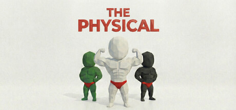
Enter the white void. Compete against thousands of clones for the title of "No.1 Physical." This is a ruthless examination of your reflexes, precision, and endurance. Master punishing trials—from split-brain multitasking to button-mashing agony. Customize, survive, and dominate the leaderboard.
Free to Play5 user reviews
Free to PlayPrecision PlatformerSports
2Crispy Studio30 Jan, 2026