Quick text summary
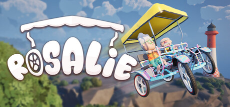
Rosalie scored 77/100 on Steam Analyzer — Good for a Early Access capsule. Top priority fix: [genre_clarity] Add a subtle visual cue that implies the dual-control mechanic, such as highlighting the two riders with distinct poses or color emphasis to telegraph co-op coordination gameplay.
Capsule scores by dimension
- Genre Clarity: 8/10 — Clear casual co-op adventure vibe. The pedal car prominently centered with two riders, combined with the scenic coastal lighthouse backdrop and playful art style, immediately communicates a lighthearted co-op experience. At TINY size the vehicle silhouette and dual-player positioning remain readable, though the specific control mechanic (sit left/right to turn) is not visually obvious from the image alone.
- Title Readability: 8/10 — Bold title with strong visual impact. The 'ROSALIE' logo is rendered in thick white letterforms with a playful plate/banner underlay that maintains clarity across all sizes, positioned in the upper left with excellent contrast against the sky background. At TINY size the word remains legible and the iconic plate design reinforces brand identity effectively.
- Contrast & Color: 8/10 — Bright, saturated elements stand out. The white title text, vibrant yellow vehicle roof, and red lighthouse pop distinctly against the blue sky and Steam dark background. Strong value separation between the colorful vehicle and mid-tone landscape ensures the focal point reads clearly even when squinting or at reduced sizes.
- Uniqueness & Polish: 7/10 — Charming artistic style, mild generic feel. The illustrated art direction and whimsical pedal car design communicate personality and indie charm effectively, distinguishing it from photorealistic competitors. However, the scenic background (sky, clouds, lighthouse, hills) relies on familiar landscape elements, and without the readable game description the core mechanic (positional control) is not immediately conveyed through visual language alone.
- Brand Consistency: 7/10 — Consistent playful palette and aesthetic. The warm color palette (yellow, red, white, blue) and illustrated cartoon style create a cohesive identity, with the iconic plate-shaped logo serving as a memorable brand anchor. Internal rendering and shading are consistent across the vehicle and environment, though the design does not yet feel distinctly iconic without repeated exposure.
- Composition: 8/10 — Well-balanced focal hierarchy and depth. The pedal car occupies the center-right sweet spot with strong primary focus, the title anchors the upper left without competing for attention, and the landscape layers create depth from foreground vehicle through mid-tone hills to sky background. Safe margins are respected, and the layout remains balanced and readable at SMALL and TINY scales without awkward cropping or empty voids.
What works
- Strong title contrast and legibility. White bold letterforms with plate underlay maintain excellent readability across all viewing sizes against sky and dark backgrounds.
- Clear focal point with depth layering. The centered pedal car draws the eye immediately, supported by cohesive background elements that create visual depth without clutter.
- Distinctive art style and color palette. Warm, saturated colors and playful illustrated aesthetic differentiate the capsule from realistic action games and communicate indie charm.
What hurts the capsule
- Core mechanic not visually apparent. The sit-left-turn-left control scheme is not communicated through composition alone; a player unfamiliar with the game cannot infer the unique dual-control gameplay from the image.
- Generic landscape background. The scenic background (sky, clouds, lighthouse, hills) uses familiar visual tropes that do not immediately signal what makes Rosalie unique or memorable.
Priority fixes
- [genre_clarity] Add a subtle visual cue that implies the dual-control mechanic, such as highlighting the two riders with distinct poses or color emphasis to telegraph co-op coordination gameplay.
- [uniqueness_polish] Introduce a signature visual motif or character element in the scene (e.g., exaggerated passenger expressions, a unique decal on the car, or a memorable landmark) that reinforces brand identity and stands out at TINY size.
- [composition] Ensure the two riders on the pedal car are more visually distinct in silhouette at TINY size to better communicate the 'two-player sharing one vehicle' hook.
Store copy priority fixes
- [feature_communication] Add a sentence clarifying whether the game features multiple paths, levels, or a single linear route, and how the photo mechanic ties into progression or rewards.
- [feature_communication] Expand the solo mode description to explain what makes it distinct mechanically—do steering challenges, obstacles, or level design change to compensate for single-player control?
- [uniqueness] Add a brief statement explicitly comparing this to other co-op driving or parkour games to reinforce why the split-control mechanic is uniquely fun (e.g., 'Unlike traditional co-op racers, coordination chaos is the point').
Related guides
Steam app ID: 4268470 · Tags: Early Access, Indie, Online Co-Op, Multiplayer, Driving