Scoring genre clarity...
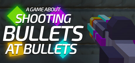
A 3D incremental FPS game where you don’t move, only your bullets do. You’re stuck in space with nothing to do but shoot bullets...at bullets. Watch bullets bounce out of control, numbers explode, and a quiet room turn into pure chaos.
$0.998 user reviews
CasualIdlerFPS
NourSaiFRMar 3, 2026