Scoring genre clarity...
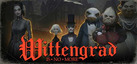
Wittengrad is no more is a surreal, narrative walking sim with horror elements. The city's foggy streets will lead you through the story of a single evening in Barnaba’s life. You will encounter the peculiar inhabitants of Wittengrad, though… does it even matter? After all, Wittengrad is gone.
$4.99Positive(20)
AdventureWalking Simulator3D
FaynogamesApr 8, 2026