Scoring genre clarity...

Factorio capsule

Factorio

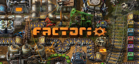
Factorio is a game about building and creating automated factories to produce items of increasing complexity, within an infinite 2D world. Use your imagination to design your factory, combine simple elements into ingenious structures, and finally protect it from the creatures who don't really like you.

$35.00Overwhelmingly Positive(1,453)
AutomationBase BuildingResource Management
Wube Software LTD.Aug 14, 2020

Factorio scores 80/100 — better than 86% of Automation capsules (n=687).

Overwhelmingly Positive (1,453 reviews) · $35.00 · Released Aug 14, 2020 · By Wube Software LTD.

Quick text summary

Factorio scored 80/100 on Steam Analyzer — Good for a Automation capsule. Top priority fix: [composition] Introduce a subtle darkened or blurred background band directly behind the FACTORIO title to isolate it from the busy machinery texture and improve legibility at small sizes.

Capsule scores by dimension

  • Genre Clarity: 9/10 — Factory automation genre instantly clear. The top-down view packed with conveyor belts, industrial machinery, oil derricks, robotic arms, and rail tracks immediately communicates factory-building and automation. Even at tiny size, the dense mechanical complexity and isometric industrial layout signals the simulation/strategy genre unmistakably. There is zero genre ambiguity — this reads as a factory builder from any viewing distance.
  • Title Readability: 8/10 — Bold orange logo reads well at most sizes. The 'FACTORIO' logotype uses a bold, chunky orange font with a gear integrated into the final letter, centered in the upper-middle area over a relatively controlled background region. At full size it reads clearly with strong contrast against the busy background. At tiny size the letterforms are still distinguishable due to the high-contrast orange against the darker mechanical environment, though the gear detail in the 'O' becomes indistinguishable at the smallest scale.
  • Contrast & Color: 7/10 — Orange title pops, background dense but workable. The warm orange title creates a clear focal point against the cooler steel and earth tones of the factory floor. The overall image is busy and mid-value throughout, which means silhouette separation is limited and the scene can feel flat in grayscale — machines blend into each other. Against Steam's dark #1b2838 background, the image holds reasonable contrast at its borders, particularly the lighter mechanical elements in the upper region.
  • Uniqueness & Polish: 8/10 — Iconic factory density is a unique fingerprint. The sheer visual density of interlocking systems — conveyor belts, inserters, trains, oil rigs, assemblers all visible simultaneously — is a uniquely Factorio visual signature that no other game replicates. The art style is consistent and the capsule effectively communicates the core loop of 'build a massive factory' as a single image. It avoids generic character poses or generic scenery, instead letting the gameplay itself be the hero, which is a confident and distinctive choice.
  • Brand Consistency: 9/10 — Immediately recognizable Factorio visual identity. The orange gear-integrated logo, the top-down isometric factory aesthetic, the warm industrial palette, and the specific art style of machinery are all deeply associated with Factorio's established brand. Anyone familiar with the game would identify it instantly from any element in isolation. The capsule uses the game's own visual language as the primary identity signal, which is highly effective and internally cohesive.
  • Composition: 7/10 — Dense fill with centered title anchor. The title 'FACTORIO' is placed centrally in the upper third, providing a clear focal anchor amid the complex scene beneath it. The composition intentionally fills every pixel with factory content, which serves the brand message but creates visual noise with no clear secondary focal point or depth layering. At small and tiny sizes, the title remains the primary readable element but the scene beneath it becomes an undifferentiated mechanical mass rather than a guided visual narrative.

What works

  • Instant genre communication. The dense factory floor with conveyor belts, inserters, and rail tracks communicates the automation builder genre in under one second at any size.
  • Strong orange title contrast. The bold orange FACTORIO logotype stands out clearly against the cooler industrial background tones and remains legible at small capsule size.
  • Gameplay as the visual hero. Using the factory itself rather than a character or cinematic scene as the main visual is a confident, memorable, and genre-accurate choice.
  • Highly recognizable brand identity. The gear-in-O logo and specific art style create an immediately recognizable signature that fans and informed buyers identify instantly.

What hurts the capsule

  • Excessive visual density at tiny size. At 120x45 pixels, the factory scene collapses into an undifferentiated mechanical texture with no clear secondary focal point or readable detail.
  • Limited grayscale contrast in scene. In a mental grayscale test, much of the factory machinery shares similar mid-values causing silhouettes to blend together and reducing separation clarity.
  • No depth layering or visual hierarchy below title. The scene has no clear foreground, midground, and background separation to guide the eye — everything competes at roughly equal visual weight.
  • Title sits on busy texture region. Although the orange provides good contrast, the letterforms are placed over complex mechanical texture rather than a deliberately controlled clean region, which slightly softens legibility.

Priority fixes

  1. [composition] Introduce a subtle darkened or blurred background band directly behind the FACTORIO title to isolate it from the busy machinery texture and improve legibility at small sizes.
  2. [contrast_color] Darken the midground factory elements slightly to create stronger value separation between the lower scene and the title, improving grayscale readability and silhouette clarity.
  3. [composition] Establish one visually dominant element in the factory scene — such as a highlighted assembler chain or a prominent train — to create a secondary focal point that guides the eye at small capsule sizes.
  4. [title_readability] Increase the font weight or add a thin dark outline or drop shadow to the FACTORIO logotype to ensure letters remain distinct at the 120x45 tiny thumbnail size.

Store copy priority fixes

  1. [tone_match] Move or remove the 'Discount Disclaimer' from the body copy; consider placing it in a separate note or footer to preserve the narrative flow and game-focused voice.
  2. [feature_communication] Add a brief sentence clarifying the role and intensity of combat/defense—e.g., 'Defend your factory from increasingly aggressive alien creatures, or turn combat off for peaceful factory building.'
  3. [audience_targeting] Include a mention of difficulty settings or accessibility features to signal that the game is welcoming to players of all experience levels, not just optimization veterans.

Related guides

Steam app ID: 427520 · Tags: Automation, Base Building, Resource Management, Sandbox, Crafting