Scoring genre clarity...
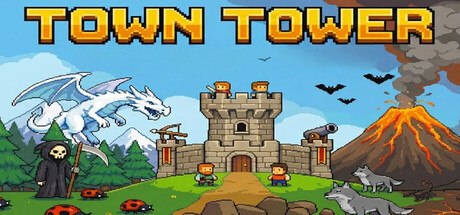
A strategic tower defense game where management is key. Build houses to generate villagers, gather resources, and erect an impenetrable defense. Withstand increasingly powerful waves of enemies and prevent them from destroying your tower.
$1.99No user reviews
StrategyTower DefenseFantasy
Humbertronics ArtsJan 31, 2026