Scoring genre clarity...

Dusk Park capsule

Dusk Park

An exploration adventure game where you search for a way to escape a building that traps you at dusk.

$4.992 user reviews
AdventureHidden ObjectPsychological Horror
GattoroccoJan 31, 2026

Dusk Park scores 68/100 — better than 22% of Adventure capsules (n=7,922).

2 user reviews · $4.99 · Released Jan 31, 2026 · By Gattorocco

Quick text summary

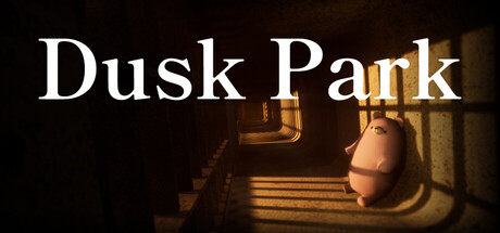
Dusk Park scored 68/100 on Steam Analyzer — Solid for a Adventure capsule. Top priority fix: [uniqueness_polish] Introduce a distinctive visual element—signature object, character silhouette, or color accent—in the composition to differentiate from comparable indie exploration titles.

Capsule scores by dimension

  • Genre Clarity: 7/10 — Exploration mystery clearly signaled. The warm institutional interior, dim lighting, and claustrophobic hallway composition immediately suggest an exploration or escape-room style game. The dusk/twilight quality of the lighting reinforces the atmospheric mystery premise. At tiny size, the architectural setting and golden isolation read as adventure-exploration rather than action or puzzle, though the specific subgenre (escape-building) is not instantly obvious without context.
  • Title Readability: 8/10 — Clean serif title, strong legibility. The title 'Dusk Park' uses a classic serif typeface in crisp white with excellent contrast against the dark background. The text is positioned in the upper third with clean negative space, maintaining full readability at both small and tiny sizes. The letterforms are generous and well-spaced, avoiding the collapse that plagues decorative fonts at reduced scales.
  • Contrast & Color: 8/10 — Strong value separation and warmth. The white title text pops decisively against the near-black background, creating excellent silhouette clarity. The warm golden-orange interior lighting in the background creates distinct value separation between the foreground darkness and mid-ground illumination. In grayscale, the composition maintains strong tonal hierarchy with clear edges, ensuring the design reads at any size against Steam's dark theme.
  • Uniqueness & Polish: 6/10 — Competent but visually conventional. The capsule executes a moody institutional interior aesthetic cleanly, but the composition (hallway perspective, warm light source, minimal figures) follows familiar indie exploration game visual language seen in titles like DREDGE and Chants of Sennaar. The craft is solid—good lighting, atmospheric depth—but the concept lacks a distinctive visual hook or memorable icon that differentiates it from other atmospheric indie adventures.
  • Brand Consistency: 5/10 — Minimal identity cues visible. The capsule shows a neutral institutional setting without clear brand iconography, signature character, or memorable visual motif that would aid later recognition. While the dusk/warm-light aesthetic may be consistent with game assets, there are no distinctive design marks, color palette signatures, or recognizable symbols that create lasting brand memory from this single image alone.
  • Composition: 7/10 — Clear hierarchy with safe margins. The title anchors the top in a protected area away from edges, and the warm hallway interior naturally draws the eye to the center-background depth perspective. The composition uses layering (dark foreground, illuminated mid-ground) to create visual depth and guides attention without clutter. At tiny size, the warm glow and architectural structure remain clear, though the small figure and doorway detail become abstract shapes rather than recognizable elements.

What works

  • Legible title design. White serif typeface with strong contrast maintains readability from full size down to tiny thumbnail without collapse or degradation.
  • Atmospheric depth and lighting. Warm golden interior lighting creates clear value separation and visual layering that reads distinctly at any scale against the Steam dark background.
  • Safe title placement. Text positioned in upper third with clean negative space ensures no cropping risk and maximum legibility across all Steam display sizes.

What hurts the capsule

  • Generic atmosphere trope. The moody hallway with warm light is a familiar visual language in indie exploration games, lacking a distinctive visual hook or unique selling point.
  • Weak brand identity signals. No iconic character, motif, logo, or signature palette element visible that would create recognition or memorability beyond the immediate scene.
  • Minimal figure becomes abstract. At tiny size, the small human silhouette in the background reads as an indistinct shape rather than a recognizable game element, reducing emotional connection.

Priority fixes

  1. [uniqueness_polish] Introduce a distinctive visual element—signature object, character silhouette, or color accent—in the composition to differentiate from comparable indie exploration titles.
  2. [brand_consistency] Develop a recognizable motif or symbol (door lock style, architectural detail, or icon) that could appear across multiple marketing assets to build brand recall.
  3. [genre_clarity] Add a subtle UI or gameplay-specific cue (cursor, key, lock, or interface element) to clarify the escape/puzzle mechanic beyond pure atmosphere.

Store copy priority fixes

  1. [hook_strength] Rewrite the short description to lead with an evocative image or emotional state rather than the mechanic—e.g., 'Trapped in a building bathed in dying light, hunted by something unseen, with no way out and one chance to survive.'
  2. [uniqueness] Add a sentence in the Gameplay section that articulates the core design philosophy or what separates this game's escape puzzle from standard hidden object games—e.g., how randomization creates replayability or how the pursuer intensifies decision-making.
  3. [tone_match] Expand the Story or opening paragraphs to include sensory or atmospheric language that reinforces psychological horror—the disorientation of waking in an unfamiliar place, the oppressive quality of the sunset light, or the dread of being hunted.
  4. [audience_targeting] Add a single sentence that clarifies whether this game is designed for hardcore permadeath players, puzzle enthusiasts, horror fans, or a combination thereof, to help self-selection.

Related guides

Steam app ID: 4279190 · Tags: Adventure, Hidden Object, Psychological Horror, Horror, First-Person