Scoring genre clarity...

House Of Nowhere capsule

House Of Nowhere

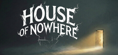
Survive a merciless hunt in the House of Nowhere. Alone in a haunting home that no longer feels like your own, you must solve puzzles to escape into a vast, silent forest. Scavenge for your life and uncover the truth before the ancient thing hunting you turns your story into a forgotten legend.

$9.992 user reviews
PuzzleAction3D
Glassroot InteractiveFeb 20, 2026

House Of Nowhere scores 72/100 — better than 45% of Puzzle capsules (n=4,408).

2 user reviews · $9.99 · Released Feb 20, 2026 · By Glassroot Interactive

Quick text summary

House Of Nowhere scored 72/100 on Steam Analyzer — Good for a Puzzle capsule. Top priority fix: [uniqueness_polish] Introduce a signature visual element or character silhouette (e.g., a distorted figure, unique creature shape, or iconic object) that appears consistently across store assets to create instant brand recognition.

Capsule scores by dimension

  • Genre Clarity: 7/10 — Horror survival with puzzle elements clear. The jagged, skeletal title treatment and dark atmospheric mist immediately signal horror genre, while the mysterious glowing doorway and desolate environment suggest survival and exploration mechanics. At tiny size, the silhouette of the haunted house motif and ominous mood remain readable, though the specific puzzle-survival blend could be clearer—it reads more as pure horror than action-adventure hybrid.
  • Title Readability: 8/10 — Strong weathered font holds up well. The title 'HOUSE OF NOWHERE' uses a distressed, bone-like serif font with heavy outline that maintains clarity across full, small, and tiny sizes due to high contrast against the dark background and deliberate letter spacing. The irregular skeletal styling is thematic and legible rather than decorative-illegible, and the centered top placement over a controlled dark region ensures it doesn't compete with background noise. At tiny size it compresses predictably but remains identifiable as text.
  • Contrast & Color: 8/10 — High value separation, moody cohesion. Bright white distressed title sits in sharp relief against dark teal-green background, and the golden-yellow doorway provides a warm focal accent that draws the eye without clashing. The value range is intentionally limited to enhance mood (dark greens, blacks, warm amber) rather than vibrant saturation, which works well for the horror atmosphere and reads clearly in grayscale silhouette tests. Mist and lighting create natural depth and separation between subject and background.
  • Uniqueness & Polish: 7/10 — Atmospheric and themed but familiar tropes. The capsule demonstrates solid craft with cohesive lighting, deliberate color grading, and thematic skeletal typography that reinforces the 'haunted house' core concept rather than generic spooky imagery. However, the composition—mysterious doorway, fog, dark house—follows well-established indie horror visual language seen in titles like DREDGE and Slay the Princess, limiting distinctiveness. The execution is premium, but the visual hook is recognizable rather than signature.
  • Brand Consistency: 6/10 — Thematic but lacks iconic identity anchor. The capsule establishes internal consistency through a cohesive dark-ambient color palette, distressed typography style, and mysterious doorway motif that align with survival-horror genre expectations and the game's narrative premise. However, without reference to the 11 available screenshots, there are no obvious signature brand elements like a recurring character, logo symbol, or unique visual signature that would make this capsule instantly recognizable as 'House of Nowhere' versus generic haunted house media. The mood is consistent but not distinctly branded.
  • Composition: 7/10 — Clear focal point with balanced depth. The glowing doorway forms a strong central focal point that guides the eye naturally, while the title anchors the top third without competing for attention, and the surrounding mist creates atmospheric framing. The composition holds together well at small and tiny sizes because the doorway remains the obvious primary subject even when compressed. Slight concern: the title and doorway are vertically stacked in center, which is safe but somewhat conventional; the composition could feel more dynamic, though the current approach prioritizes clarity for discovery.

What works

  • Legible distressed title design. Bone-textured serif font with clear outline maintains readability at all sizes while reinforcing the horror theme through aesthetic choice rather than sacrificing function.
  • Strong atmospheric color grading. Limited dark teal-green-to-golden palette creates cohesive mood and high value contrast that pops against Steam's dark background and reads clearly in quick-scroll conditions.
  • Clear focal hierarchy. The glowing doorway and mist naturally draw focus as the primary subject, while the title provides context without competing, ensuring legibility at small and tiny sizes.

What hurts the capsule

  • Generic horror house visual trope. Mysterious doorway + fog + dark atmosphere is familiar territory in indie horror (DREDGE, Slay the Princess), limiting distinctive brand recognition despite solid execution.
  • No iconic character or symbol anchor. The capsule communicates the genre and mood but lacks a memorable branded element (unique character, logo, or signature visual motif) that would stand out in a crowded genre.
  • Conventional centered vertical stack. Title and doorway are stacked centrally, which is safe and clear but visually predictable compared to more dynamic top-performing indie horror capsules.

Priority fixes

  1. [uniqueness_polish] Introduce a signature visual element or character silhouette (e.g., a distorted figure, unique creature shape, or iconic object) that appears consistently across store assets to create instant brand recognition.
  2. [composition] Shift title or doorway position slightly off-center or introduce a secondary focal element (human figure, artifact, environmental detail) to create more visual depth and distinction.
  3. [brand_consistency] Reference the 11 store screenshots to ensure the capsule's color palette, typography, and motifs align with and preview the game's visual identity, creating a cohesive brand signal.

Store copy priority fixes

  1. [feature_communication] Replace 'Fight Back: Look for ancient artifacts and gather the tools needed to turn the tide against the creature hunting you' with a specific mechanic description: e.g., 'Craft defensive items from scavenged materials, discover ancient wards that repel the creature, or learn its weakness through puzzle clues to turn the tables.'
  2. [uniqueness] Add one sentence to the short description or opening of detailed description that articulates a unique selling point, such as: 'Unlike traditional haunted-house games, the forest offers true freedom—but the creature adapts to your route, forcing constant tactical decisions.'
  3. [feature_communication] In SURVIVE THE SILENCE section, specify what resources are limited and how they are managed: e.g., 'Manage your torch fuel, mental resilience, and food supplies as you navigate deeper into suffocating darkness.'
  4. [genre_clarity] Add a single sentence after KEY FEATURES that summarizes the threat and core conflict: 'Balance exploration and puzzle-solving against an intelligent predator that learns your patterns—silence is your only defense.'

Related guides

Steam app ID: 4279860 · Tags: Puzzle, Action, 3D, Adventure, First-Person