Scoring genre clarity...

PinballGarden capsule

PinballGarden

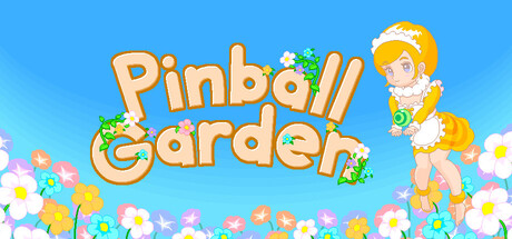
Set in the charming world of “Garden,” where tiny creatures and playful spirits gather, this pinball game features two modes: CLASSIC, a single-player challenge for high scores, and VERSUS, a multiplayer race to fill the honey gauge first.

$6.993 user reviews
2D PlatformerPvPArcade
Shuji ShimizuMar 26, 2026

PinballGarden scores 82/100 — better than 95% of 2D Platformer capsules (n=1,970).

3 user reviews · $6.99 · Released Mar 26, 2026 · By Shuji Shimizu

Quick text summary

PinballGarden scored 82/100 on Steam Analyzer — Good for a 2D Platformer capsule. Top priority fix: [genre_clarity] Incorporate a subtle pinball table, flipper, or ball element into the composition to reinforce the pinball mechanic alongside the garden theme.

Capsule scores by dimension

  • Genre Clarity: 8/10 — Clear casual garden pinball theme. The capsule immediately communicates a casual, cheerful garden aesthetic with bright flowers, a playful character, and the word 'Pinball' in large text. The blonde character with floral elements and pastel color palette clearly signals a lighthearted, family-friendly casual game. At tiny size, the silhouette and color scheme remain readable and the genre implication stays strong, though the pinball mechanics are not visually emphasized.
  • Title Readability: 9/10 — Highly readable dual-line title. The title 'Pinball Garden' uses a bold, chunky sans-serif font with clear spacing and strong contrast against the blue sky background. At both full and tiny sizes, the letterforms remain crisp and legible; the outline/weight of the characters ensures no collapse at thumbnail scale. Strategic placement on a clear background region avoids competition with busy floral elements.
  • Contrast & Color: 9/10 — Vibrant color pop on dark background. The bright blue sky, warm peach/orange title text, and saturated pastel flowers create strong value separation and silhouette clarity against Steam's dark background. The character and flowers maintain vivid saturation without muddy mid-tones, and the composition reads immediately at small size. Grayscale test confirms clear light-dark separation between subject and sky.
  • Uniqueness & Polish: 8/10 — Polished charm with distinctive art style. The illustrated character design, floral decorations, and cohesive pastel palette communicate a premium, intentional aesthetic that stands apart from generic casual game capsules. The garden-meets-character hook suggests a unique selling point beyond a blank pinball theme. Craft is evident in the soft lighting, color harmony, and playful character pose that convey personality.
  • Brand Consistency: 7/10 — Consistent garden aesthetic, limited icons. The warm peach-beige title, soft pastels, cheerful character, and garden setting create internal cohesion across the visible capsule. The blonde character with floral accessories is a potential recognizable motif, though without reference to the other 6 screenshots, it is difficult to confirm whether this character or palette is consistently deployed. The style feels cohesive but not yet iconic.
  • Composition: 8/10 — Well-balanced focal hierarchy and depth. The title anchors the center-left with the character positioned top-right, creating a balanced visual flow and clear depth layering: flowers in the foreground, character in mid-ground, sky in background. At small and tiny sizes, the eye is drawn first to the title, then to the character, avoiding scattered attention. Safe margins are respected and no critical elements sit dangerously close to edges.

What works

  • Strong title contrast and legibility. Chunky, bold sans-serif remains crisp and readable at all sizes from full header to tiny thumbnail.
  • Vibrant color palette that pops. Saturated pastels and bright sky create immediate visual appeal and clear separation from Steam's dark background.
  • Playful character with personality. The blonde, floral-decorated character conveys charm and hint at the game's lighthearted casual tone.
  • Clean visual hierarchy and depth. Title, character, and flowers are layered to guide the eye without clutter or competing focal points.

What hurts the capsule

  • Pinball mechanic not visually implied. Despite the genre-leading context, there is no visual hint of pinball gameplay (flippers, ball, table, or machine aesthetic).
  • Limited brand identity cues. While charming, there is no clear iconic symbol or motif that would be instantly recognizable as 'PinballGarden' brand across different contexts.
  • Multiplayer/versus mode not communicated. The capsule does not hint at the VERSUS multiplayer feature; it reads as a single-character, single-player experience.

Priority fixes

  1. [genre_clarity] Incorporate a subtle pinball table, flipper, or ball element into the composition to reinforce the pinball mechanic alongside the garden theme.
  2. [brand_consistency] Develop and emphasize a consistent iconic character or symbol (the blonde character is a start) that becomes the visual anchor across all store materials.
  3. [composition] Consider adding a small VERSUS badge or second character hint to suggest the multiplayer mode and differentiate from single-player casual games.

Store copy priority fixes

  1. [hook_strength] Rewrite the short description to open with a specific gameplay action: 'Flick pinball across a blooming garden to awaken flowers and collect honey in solo or split-screen races.'
  2. [feature_communication] Add a sentence explaining the actual pinball mechanics: 'Use flippers to keep the Honey Ball bouncing, hit ramps and targets to awaken flowers, and build combos to fill the honey gauge.'
  3. [uniqueness] Insert a clear differentiator: 'Pinball Garden uniquely blends classic pinball physics with a garden-tending progression system, where each flower awakened unlocks new areas and mechanics.'

Related guides

Steam app ID: 4281640 · Tags: 2D Platformer, PvP, Arcade, Cute, Action