Scoring genre clarity...

Second Humanity - (Capítulo 1) capsule

Second Humanity - (Capítulo 1)

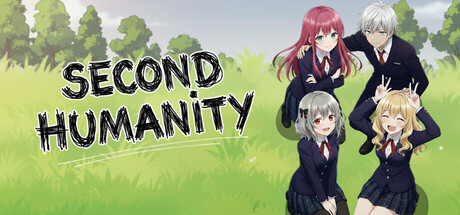
Welcome to Humanity School. Excellence is just the start. In this horror visual novel, dominate Class 02. Observe and adapt. In a place with no teachers, only judges, will you control the board or be a pawn for "Them"?

$5.991 user reviews
CasualVisual NovelImmersive Sim
SamaelCrowFeb 23, 2026

Second Humanity - (Capítulo 1) scores 70/100 — better than 29% of Casual capsules (n=10,153).

1 user reviews · $5.99 · Released Feb 23, 2026 · By SamaelCrow

Quick text summary

Second Humanity - (Capítulo 1) scored 70/100 on Steam Analyzer — Good for a Casual capsule. Top priority fix: [genre_clarity] Add subtle visual horror cues—darker color palette shift, ominous sky gradient, or unsettling character expression—to align aesthetics with horror tagline and clarify actual tone.

Capsule scores by dimension

  • Genre Clarity: 7/10 — Visual novel with horror undertones. The anime character grouping and school uniform aesthetic clearly signal a visual novel game set in an educational institution. The bright, pastoral background and cheerful character poses create tension with the horror description, making the genre feel slightly mixed at tiny size, though the character-focused composition and visual novel framing are readable. At tiny size, you recognize 'visual novel' but the horror element is not visually apparent from aesthetics alone.
  • Title Readability: 8/10 — Clear title, readable at all sizes. The title 'SECOND HUMANITY' uses bold, chunky black letters with strong white outlines positioned on the left side over the less busy yellowish grass area. The letterforms remain distinct even at tiny size due to heavy weight and outline contrast. Tagline text below the title becomes unreadable at small/tiny sizes but does not impede core title legibility.
  • Contrast & Color: 8/10 — Strong separation against dark background. The bright yellow-green background, white character uniforms, and distinctive colored hair (pink, white, gray, blonde) create excellent value separation against Steam's dark #1b2838 background. The black title text with white outline provides crisp silhouette clarity even at tiny size. Character figures and text both maintain clear edges and are not compromised by muddy mid-tones or blend-in issues.
  • Uniqueness & Polish: 6/10 — Competent anime style, somewhat generic. The capsule uses clean anime character art and a cohesive pastoral setting, but the composition—four school-uniformed characters posed casually in grass—follows a very common visual novel template without distinctive visual storytelling or a unique selling point hook. The art is well-executed and polished, but it reads as a solid baseline rather than memorable or standout premium presentation compared to top-tier indie game capsules.
  • Brand Consistency: 6/10 — Consistent internal style, generic identity. The capsule maintains coherent anime art direction, consistent character rendering, and a unified pastoral color palette throughout the composition. However, there are no iconic symbols, motifs, or distinctive visual elements that would create a memorable brand identity or allow recognition of this game versus dozens of other visual novel titles with similar aesthetics and school settings.
  • Composition: 7/10 — Clear focal point, solid layout balance. The title anchors the upper left in a controlled region, while four characters form a natural grouped focal point on the right and center, creating diagonal balance and guiding eye movement effectively. At small and tiny sizes, the character group and title remain the primary read without competing elements. The character grouping is slightly off-center but avoids dead center void; however, the right edge characters are positioned close to margin, risking crop loss on some aspect ratios.

What works

  • Title legibility across sizes. Bold black letters with white outline remain crisp and readable from full header down to tiny thumbnail due to heavy weight and strategic outline stroke.
  • Strong value contrast. Bright yellowish-green background and white character clothing pop distinctly against Steam's dark interface, maintaining visual separation even at tiny size.
  • Coherent art direction. Unified anime rendering style, consistent character design, and harmonious pastoral color palette create professional polish and internal cohesion.

What hurts the capsule

  • Generic visual novel template. Four school-uniformed characters in a grassy setting with casual poses follows a common visual novel formula without distinctive visual hooks or unique selling point cues.
  • Minimal brand identity signals. No iconic symbol, motif, or signature element that would allow player recognition or differentiation from other school-setting visual novels with similar aesthetics.
  • Horror genre barely communicated visually. The bright, cheerful character poses and pastoral setting contradict the horror tagline, making tone unclear and potentially misleading about the actual game experience at quick glance.

Priority fixes

  1. [genre_clarity] Add subtle visual horror cues—darker color palette shift, ominous sky gradient, or unsettling character expression—to align aesthetics with horror tagline and clarify actual tone.
  2. [uniqueness_polish] Introduce a distinctive visual element or composition hook—such as an iconic object, a unique UI frame, or a memorable setting detail—that stands out from generic school visual novel templates.
  3. [composition] Reposition right-side characters slightly left of current placement to ensure they remain visible at various Steam crop ratios and avoid edge clipping.

Store copy priority fixes

  1. [feature_communication] Define or reframe 'Affiliation,' 'Superation,' and 'Submission' using player-facing language—e.g., 'build bonds, prove intellectual dominance, or face expulsion'—so mechanics are immediately clear.
  2. [hook_strength] Clarify who or what 'Them' are in a single, concrete phrase in the detailed description to ground the mystery in a tangible threat rather than pure abstraction.
  3. [audience_targeting] Explicitly state whether this is a slow-burn psychological thriller for narrative enthusiasts or a fast-paced ARG game, and remove or justify the 'Casual' tag if the game is psychologically intense.
  4. [uniqueness] Add one sentence contrasting this game's 'dialogue-as-strategy' mechanic against standard visual novels—e.g., 'your word choices determine who lives, who falters, and who vanishes from memory.'

Related guides

Steam app ID: 4282000 · Tags: Casual, Visual Novel, Immersive Sim, 2D, Anime