Scoring genre clarity...
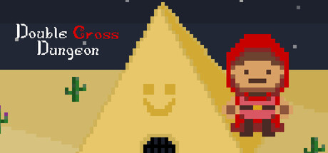
The couch co-op roguelike dungeon crawler with a twist! Compete to perform the best in each room to see who gets first pick on the Ancient cards to prepare for the final fight. Will you escape with your friends, or die trying?
Free to Play4 user reviews
Action RoguelikeDungeon CrawlerCo-op
Only 5Jan 23, 2026