Scoring genre clarity...

Beat Your Boss capsule

Beat Your Boss

Do you hate your boss? This game is made for you. Beat up your bullying bosses in a first-person parkour action game inspired by the Mirror's Edge series.

$3.861 user reviews
ActionFirst-Person3D Fighter
Shiba ArtsMay 21, 2026

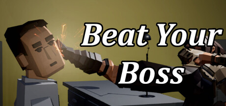
Beat Your Boss scores 62/100 — better than 3% of Action capsules (n=8,535).

1 user reviews · $3.86 · Released May 21, 2026 · By Shiba Arts

Quick text summary

Beat Your Boss scored 62/100 on Steam Analyzer — Solid for a Action capsule. Top priority fix: [contrast_color] Add a darker background gradient or silhouette outline around the character to increase subject-background separation in grayscale and strengthen edge definition at TINY size.

Capsule scores by dimension

  • Genre Clarity: 7/10 — Action game clear, parkour less evident. The first-person perspective and dynamic action pose of the character punching conveys action-adventure gameplay effectively. However, the parkour and Mirror's Edge inspiration are not visually obvious from this static capsule—it reads more as generic action combat than movement-focused gameplay. At TINY size, the character silhouette and punching motion are recognizable as action-oriented, though the specific parkour subgenre is lost.
  • Title Readability: 8/10 — Title readable, strong white contrast. The italic white text with dark outline is placed over a tan-yellow background and reads clearly at both FULL and SMALL sizes. At TINY size, the letters remain legible due to high value contrast and consistent stroke weight, though some detail in the italic flourish may soften. The placement center-right avoids the character's head, maintaining good separation from the focal point.
  • Contrast & Color: 7/10 — Warm tones pop, but muddy mid-range. The tan-beige gradient background and golden-brown character tones create warm separation from the Steam dark background #1b2838, reading well in quick scroll. However, the character model and background occupy a similar mid-tone value range, reducing silhouette clarity—the character doesn't have a sharp edge against the background in grayscale test. The white title rescues overall contrast, but the subject-background separation is softer than optimal for a competitive action title.
  • Uniqueness & Polish: 5/10 — Generic office worker, uninspired execution. The capsule shows a simple office worker character model punching, which is functional but visually generic compared to top-performing action titles. There is no distinctive art style, signature visual hook, or thematic element that communicates the 'beat your boss' premise or parkour inspiration—it relies on the title text alone to convey concept. The rendering lacks polish and visual storytelling that would elevate it beyond a basic character screenshot.
  • Brand Consistency: 4/10 — No memorable identity or franchise markers. The capsule contains no iconic character, motif, symbol, or signature palette that would be recognizable across multiple store pages or marketing materials. The generic office worker silhouette and tan background offer no internal cohesion cues or brand identity signal that could anchor the game's visual identity. Without reference to other store screenshots, this capsule alone establishes no memorable or consistent visual branding.
  • Composition: 6/10 — Centered focal point, adequate balance. The character is positioned slightly left of center with the punching action as the primary focal point, and the title is placed center-right, creating basic hierarchy. At SMALL and TINY sizes, the character and title remain the clear primary subjects. However, the composition feels static and unbalanced—the character occupies the left half while the title dominates the right, leaving the upper right quadrant under-utilized, and there is no supporting depth or layering to create visual interest.

What works

  • Title contrast and legibility. White italic text with dark outline reads clearly at all sizes, including TINY, due to strong value separation from the background.
  • Action genre signal. The punching pose and first-person perspective clearly communicate action gameplay to casual viewers in quick scroll.
  • Warm color separation from Steam dark UI. Tan and golden tones pop against the dark background #1b2838, supporting visibility in store browsing.

What hurts the capsule

  • Weak subject-background silhouette. The character model and tan background occupy similar mid-tone value ranges, reducing edge definition and clarity at SMALL and TINY sizes.
  • Generic character model and premise. The office worker lacks distinctive visual identity or art style, and the capsule communicates concept through text alone rather than visual storytelling.
  • No parkour or Mirror's Edge visual cues. The static character pose and generic office setting fail to suggest the parkour-action inspiration, misleading players about core gameplay mechanics.
  • Unbalanced composition. Character on left, title on right, with under-utilized upper right space creates a static, scattered layout with no clear depth or layering.

Priority fixes

  1. [contrast_color] Add a darker background gradient or silhouette outline around the character to increase subject-background separation in grayscale and strengthen edge definition at TINY size.
  2. [genre_clarity] Integrate parkour or movement-specific visual cues—such as dynamic camera angle, motion blur, or environmental parkour elements—to communicate the Mirror's Edge-inspired gameplay hook.
  3. [uniqueness_polish] Replace the generic office worker with a more expressive, stylized character model or add distinctive visual effects (particle systems, cel-shading, or art direction) to elevate perceived quality and polish.
  4. [composition] Rebalance the layout to create depth—add environmental context, supporting visual elements, or layered background detail that frames the character and creates visual interest at SMALL size.

Store copy priority fixes

  1. [uniqueness] Replace 'inspired by Mirror's Edge series' with one concrete mechanical differentiator—e.g., 'first-person parkour with environmental combat physics that no Mirror's Edge game offered' or remove the comp entirely and lead with the unique premise.
  2. [feature_communication] Expand each core mechanic with one concrete example: instead of 'advanced parkour mechanics,' write 'chain wall-runs, ledge-vault, and sliding transitions to reach bosses across rooftops' or similar.
  3. [hook_strength] In the short description, replace the vague Mirror's Edge reference with a specific gameplay outcome: 'Beat Your Boss combines parkour mobility with hand-to-hand combat to take down evil managers' rather than relying on an external franchise comparison.

Related guides

Steam app ID: 4291070 · Tags: Action, First-Person, 3D Fighter, Adventure, Platformer