Scoring genre clarity...

Ball Rush capsule

Ball Rush

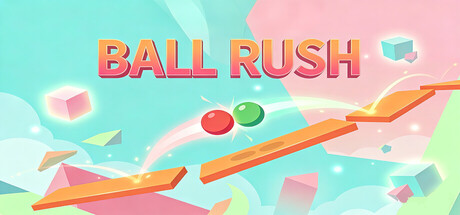
A minimalist physics puzzle platformer. Control the environment, not the ball. Tilt platforms for momentum or toggle their existence to guide two balls to meet. Challenge your timing and logic through pure physical chain reactions in a geometric world.

$0.99
CasualActionPlatformer
YuFeb 19, 2026

Ball Rush scores 75/100 — better than 65% of Casual capsules (n=10,153).

$0.99 · Released Feb 19, 2026 · By Yu

Quick text summary

Ball Rush scored 75/100 on Steam Analyzer — Good for a Casual capsule. Top priority fix: [genre_clarity] Add a subtle visual cue showing platform tilt or environmental control (e.g., an arrow or angle indicator) to communicate the unique mechanic and differentiate from generic ball physics games.

Capsule scores by dimension

  • Genre Clarity: 7/10 — Casual puzzle action clear. The bright pastel aesthetic, geometric shapes, and two colored spheres (red and green) immediately signal a casual puzzle game rather than action combat. At TINY size, the bouncing balls and tilted platform clearly communicate a physics-based mechanic, though the specific 'control environment not ball' twist is not visually apparent without context. The playful tone and minimalist geometry successfully avoid confusion with action or platformer genres.
  • Title Readability: 8/10 — Bold title excellent contrast. BALL RUSH uses a thick, orange-to-pink gradient sans-serif font with strong black outlines that stands out clearly against the cyan background at all sizes. At SMALL and TINY sizes, the title remains fully legible without collapsing, and the outline ensures letter separation even at reduced scale. The positioning in the upper left is clean and does not overlap noisy texture, maximizing readability.
  • Contrast & Color: 8/10 — Vibrant pastel separation strong. The warm orange platform and title contrast sharply against cool cyan and pink sky, creating strong value separation that reads well against the Steam dark background #1b2838. The red and green spheres pop with high saturation against the soft geometric backdrop, and silhouettes remain clear even when squinting. At TINY size, the orange stripe and colored balls maintain distinct edges despite the busy geometric field.
  • Uniqueness & Polish: 7/10 — Polished minimalist casual style. The capsule demonstrates clean craft with consistent gradient work, intentional pastel color harmony, and a cohesive low-poly aesthetic that feels premium and deliberately designed rather than templated. The floating geometric cubes and angled platform with dual-sphere focus communicate a unique puzzle mechanic visually. However, the overall style leans toward a recognizable casual indie template rather than a completely distinctive visual hook that sets it apart from other minimalist puzzle games.
  • Brand Consistency: 7/10 — Consistent geometry and palette. The pastel cyan, pink, orange, and green palette appears cohesive and likely consistent across store screenshots based on the strong color coordination visible here. The geometric cube motif and dual-sphere focus create recognizable identity cues specific to Ball Rush's core mechanic. The polished gradient treatment and minimalist approach signal a consistent art direction, though without reference to other materials, internal cohesion is strong but the identity remains somewhat generic within minimalist puzzle aesthetics.
  • Composition: 8/10 — Balanced focal points well layered. The composition uses clear depth layering: geometric cubes in background (cyan/pink), orange platform and spheres in midground, and title in upper left foreground, creating a clean hierarchy that reads at all sizes. The two colored balls sit naturally in the center area and draw focus without dominating, while the angled orange platform guides the eye and communicates the core mechanic. Safe margins are respected, and the design remains effective even at TINY size where the platform slope and dual spheres remain the clear focal point.

What works

  • Title legibility at small sizes. The thick outlined sans-serif font with strong orange-to-pink gradient maintains full readability from full header down to tiny thumbnail without collapsing or losing letter separation.
  • Clear value contrast. Warm orange platform and title stand out sharply against cool cyan and pink background, creating strong silhouette separation that works in grayscale and reads immediately in quick scroll.
  • Cohesive pastel palette. The cyan, pink, orange, and green color harmony feels intentional and premium, with consistent gradient treatment across all elements creating visual unity.
  • Effective depth layering. Clear background-midground-foreground separation with geometric cubes receding, platform and spheres in focus, and title anchoring the composition guides eye naturally without clutter.

What hurts the capsule

  • Generic minimalist aesthetic. While polished, the low-poly geometric style is a recognizable casual indie template that lacks a distinctive visual hook to differentiate from similar puzzle games.
  • Mechanic visibility limited. The core gameplay loop—controlling the environment rather than the ball—is not clearly communicated visually; viewers cannot deduce the unique control scheme from the capsule alone.
  • Busy geometric field at tiny size. The floating cubes in the background create visual noise that, when squinting at TINY size, can slightly muddy the read despite strong platform focus.

Priority fixes

  1. [genre_clarity] Add a subtle visual cue showing platform tilt or environmental control (e.g., an arrow or angle indicator) to communicate the unique mechanic and differentiate from generic ball physics games.
  2. [uniqueness_polish] Introduce a signature visual element or distinctive asset (iconic shape, character, or UI motif) that could become a recognizable brand symbol across future marketing materials.
  3. [composition] Reduce background geometric cube density or soften their opacity slightly to minimize visual noise and ensure the orange platform and dual spheres remain the unambiguous primary focal point at all sizes.

Store copy priority fixes

  1. [hook_strength] Unify the game title: change 'Ball Dash' in the detailed description to 'Ball Rush' to eliminate naming confusion in the first paragraph.
  2. [feature_communication] Add a brief sentence after Key Features explaining the progression structure or number of levels (e.g., 'Solve 50+ physics-based puzzles across escalating difficulty tiers') to clarify content depth.
  3. [audience_targeting] Mention explicitly in the short or opening detailed description who this is for—e.g., 'For fans of Portal-style puzzle design and precision platformers' to strengthen audience signal.

Related guides

Steam app ID: 4294940 · Tags: Casual, Action, Platformer, 2D Platformer, Runner