Scoring genre clarity...
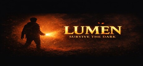
Lumen: Survive the Dark is a dark, atmospheric action roguelike where you fight relentless enemies, survive deadly encounters, and push deeper into the unknown. Master combat, adapt to chaos, and endure a world that grows more hostile every run.
$1.99
ActionAction RoguelikeRoguelite
David ChuksFeb 10, 2026