Scoring genre clarity...

Defend Against Cats capsule

Defend Against Cats

Defend Against Cats is a cute, casual tower defense game. Waves of mischievous fuzzy balls are invading your home! With your deadline creeping closer, defend your workstation before it’s too late.

$1.99Positive(18)
CasualTower DefenseStrategy
Greyhaven CraftFeb 17, 2026

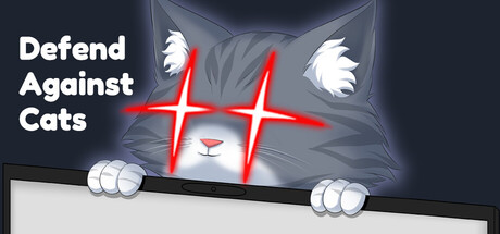
Defend Against Cats scores 82/100 — better than 92% of Casual capsules (n=10,153).

Positive (18 reviews) · $1.99 · Released Feb 17, 2026 · By Greyhaven Craft

Quick text summary

Defend Against Cats scored 82/100 on Steam Analyzer — Good for a Casual capsule. Top priority fix: [uniqueness_polish] Add subtle environmental detail (desk clutter, office setting hint) to reinforce the 'defending your workstation' narrative and increase visual storytelling depth

Capsule scores by dimension

  • Genre Clarity: 8/10 — Clear tower defense casual vibe. The oversized cat face with glowing neon crosshair eyes immediately signals a comedic tower defense game about defending against cute invaders. At tiny size, the cat silhouette and neon targeting reticle remain readable and effectively communicate the core mechanic of positioning defenses against fuzzy enemies.
  • Title Readability: 9/10 — Excellent contrast and clarity. White serif typography on dark blue-gray background provides strong value separation and remains fully legible at both small and tiny sizes. The title sits in a safe left-side region with clear margins, avoiding the busy cat illustration, and the straightforward sans-serif font maintains crisp edges even at thumbnail scale.
  • Contrast & Color: 9/10 — Strong silhouette separation. Bright red neon crosshair pops dramatically against the cool gray cat and dark background, while white paws and title create clear value hierarchy. The grayscale test confirms distinct separation between subject and background; the neon glow effect adds depth and maintains clarity even when squinting or viewing at tiny sizes.
  • Uniqueness & Polish: 8/10 — Distinctive neon aesthetic. The combination of a cute cat face with aggressive neon crosshair creates a memorable hook that signals both humor and tower defense gameplay. The glowing red reticle effect feels intentional and premium rather than generic, distinguishing this from standard casual game capsules while remaining thematically coherent with the 'defend' concept.
  • Brand Consistency: 7/10 — Cohesive cute-versus-defense theme. The neon crosshair motif and oversized cat illustration establish a recognizable identity that balances cuteness with defensive urgency. The dark blue-gray palette and red accent create a consistent visual language, though without reference to additional store screenshots, internal cohesion appears solid but the broader brand identity cannot be fully verified.
  • Composition: 8/10 — Clear focal point with smart layout. The cat face is centered as the primary subject while the title anchors the left side, creating balanced hierarchy without cluttering prime real estate. The composition maintains clear readability across all three size tests, with adequate margins and a natural flow that guides the eye from title to the distinctive neon crosshair focal point.

What works

  • Memorable neon crosshair hook. The glowing red targeting reticle over cute cat eyes instantly communicates both the tower defense mechanic and humorous tone, creating a distinctive visual identity.
  • Legible title placement and contrast. White text on dark background with safe left-side positioning ensures the title remains crisp and readable at all sizes without competing with the illustration.
  • Strong value separation. The bright red neon and white paws create clear silhouette definition that survives the tiny thumbnail test and maintains visual punch in grayscale.

What hurts the capsule

  • Limited color palette variety. Reliance on blue-gray, white, and red leaves the capsule feeling somewhat monochromatic, potentially limiting visual richness compared to high-performing genre peers.
  • Generic cat expression. While the neon effect is distinctive, the cat's neutral expression and standard cute illustration lack the personality punch of standout indie games like Little Kitty, Big City.

Priority fixes

  1. [uniqueness_polish] Add subtle environmental detail (desk clutter, office setting hint) to reinforce the 'defending your workstation' narrative and increase visual storytelling depth
  2. [contrast_color] Introduce a complementary warm accent color (orange glow or warm light source) to break up the cool palette and increase visual interest at small sizes
  3. [composition] Strengthen the cat's expression or pose to convey urgency or mischief, making the interaction feel more dynamic and less static

Store copy priority fixes

  1. [feature_communication] Add a sentence specifying average playtime per run and total number of levels or work days (e.g., 'Each work day takes 10–15 minutes, with 5 increasingly challenging days leading to different endings').
  2. [audience_targeting] Include a one-sentence accessibility signal, such as 'No strict time limit—pause and play at your own pace' or 'Designed for players of all skill levels,' to clarify whether this is casual-only or has depth for strategy fans.
  3. [uniqueness] Add a brief differentiator such as 'the only tower defense where your enemies are adorable and your goal is productivity survival, not total victory' to cement what makes this stand out.

Related guides

Steam app ID: 4297920 · Tags: Casual, Tower Defense, Strategy, Cute, Cats