Scoring genre clarity...

Savior List capsule

Savior List

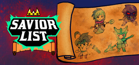
Savior List is a roguelike bullet hell dungeon crawler where evry run you pick a hero, dive into procedural generated dungeons, and fight skull monster enemy. Dodge bullet storms, open mysterious chests, and save the captured princesses and complete the Savior List.

$3.992 user reviews
Action2D FighterAction Roguelike
FromSolo StudioFeb 26, 2026

Savior List scores 70/100 — better than 29% of Action capsules (n=8,534).

2 user reviews · $3.99 · Released Feb 26, 2026 · By FromSolo Studio

Quick text summary

Savior List scored 70/100 on Steam Analyzer — Good for a Action capsule. Top priority fix: [uniqueness_polish] Introduce a signature visual element such as an iconic lead character silhouette or distinctive UI motif that communicates the roguelike bullet-hell mechanic more directly.

Capsule scores by dimension

  • Genre Clarity: 7/10 — Indie action with clear character focus. The capsule clearly communicates an action-indie aesthetic through the cartoon character art style, playful protagonist poses, and dynamic positioning of multiple heroes on a treasure map visual. At tiny size, the colorful character silhouettes and map motif still read as adventure-action gameplay, though the specific roguelike bullet-hell subgenre is not immediately obvious from visuals alone.
  • Title Readability: 8/10 — Bold logo with strong contrast. The SAVIOR LIST logo uses white boldface text with thick black outline and bright green/cyan spiky badge frame that stands out sharply against the dark red textured background. The logo remains legible at small and tiny sizes due to the outline weight and high-contrast color treatment, though the banner ribbon detail becomes less distinct at thumbnail scale.
  • Contrast & Color: 8/10 — Strong warm-cool separation. The capsule leverages warm orange-yellow tones in the map and characters against the cool dark purple-red background, creating clear value separation and silhouette definition. The bright cyan-green badge frame adds a pop that guides attention, and the character sprites maintain edge clarity even at tiny size due to solid color fills and dark outlines.
  • Uniqueness & Polish: 6/10 — Competent indie style, modest originality. The cartoon character art and map aesthetic fit the indie roguelike niche well, with clean sprite work and intentional color choices, but the overall visual concept feels familiar within the indie action space and does not communicate a unique mechanical hook or distinctive art direction that sets it apart. The composition is functional but does not suggest a memorable selling point beyond 'pick heroes and explore dungeons.'
  • Brand Consistency: 6/10 — Coherent but generic indie palette. The warm orange map, cartoon character style, and bright accent colors create internal visual cohesion, and the spiky badge logo is a recognizable identity marker. However, the overall aesthetic lacks a signature motif or iconic character that would enable immediate recognition; it reads as a well-executed indie game but not a distinctive brand.
  • Composition: 7/10 — Balanced layout with clear focal areas. The logo anchors the left side with breathing room, while the map and character group occupy the right, creating natural left-to-right reading flow and avoiding center void. The character cluster reads well at small size, and the map unfolds clearly; however, at tiny size the fine character details begin to compress and the overall scene becomes slightly crowded, reducing visual hierarchy slightly.

What works

  • Logo contrast and outline weight. The white text with thick black outline and bright green spiky frame pops cleanly against the dark background and remains legible at all sizes.
  • Warm-cool color separation. Orange map and characters against dark purple-red background create strong value contrast that aids silhouette clarity and quick visual parsing.
  • Readable character group layout. Multiple hero sprites are positioned dynamically on the map without overlapping clutter, and their diverse poses create visual interest at full size while still reading as a cohesive hero roster at small scale.

What hurts the capsule

  • Generic visual concept. The cartoon characters on a treasure map is a familiar indie trope that does not communicate a unique gameplay mechanic or memorable selling point.
  • Limited brand identity. No iconic character, signature symbol, or distinctive color palette emerges that would enable the capsule to be recognized in a crowded genre list.
  • Fine detail loss at tiny size. Character expression, map details, and supporting visual cues compress and blur at thumbnail scale, reducing the charm and readability of the sprite work.

Priority fixes

  1. [uniqueness_polish] Introduce a signature visual element such as an iconic lead character silhouette or distinctive UI motif that communicates the roguelike bullet-hell mechanic more directly.
  2. [genre_clarity] Add a subtle visual cue such as a bullet pattern, danger symbol, or procedural dungeon hint to reinforce the bullet-hell subgenre expectation.
  3. [brand_consistency] Establish a more memorable color accent or character pose that could serve as a repeatable brand marker across store assets and marketing.

Store copy priority fixes

  1. [feature_communication] Expand the detailed description with specifics: explain what the Savior List is, how many heroes are playable, what upgrade or progression systems exist between runs, and what players unlock by completing objectives.
  2. [hook_strength] Rewrite the opening line to lead with a stronger emotional or gameplay hook: 'Master a roster of unique heroes and claw your way through procedurally generated dungeons in this fast-paced bullet hell roguelike' or similar, positioning the player as the active agent.
  3. [uniqueness] Add a sentence explaining what differentiates Savior List from other bullet hell roguelikes: unique hero mechanics, art style, difficulty curve, narrative twist, or specific gameplay innovation.
  4. [tone_match] Revise all copy to correct typos ('evry' → 'every'), improve phrasing ('skull monster enemy' → 'skull-faced enemies'), and add voice appropriate to indie action games—either wit, atmosphere, or thematic flavor matching the pixel art aesthetic.

Related guides

Steam app ID: 4302070 · Tags: Action, 2D Fighter, Action Roguelike, Roguelike, Bullet Hell